visible-labels
Mobile validation
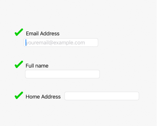
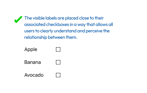
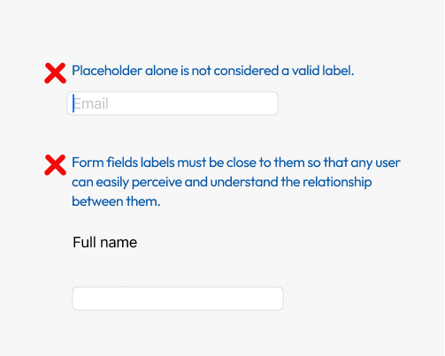
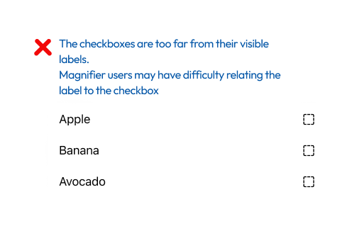
Provide a visible, persistent label for every input field, such as text fields, checkboxes, switches, and sliders. Place the label close to its field, so users can easily perceive the relationship between them, including people who use a screen magnifier and see only part of the screen at a time. Place labels directly above text fields, and in line with checkboxes and switches. Don't rely on a placeholder as the label. It disappears as soon as users type, which leaves them unsure of the field's purpose, and is especially hard for people with cognitive disabilities.
Pass Patterns
Text fields with visible labels
Checkboxes with labels close to them
iOS
A visible label, “Volume”, is placed above the slider.
let volumeLabel = UILabel()
volumeLabel.text = "Volume"


let volumeSlider = UISlider()
volumeSlider.minimumValue = 0
volumeSlider.maximumValue = 100
volumeSlider.accessibilityLabel = "Volume"


let stack = UIStackView(arrangedSubviews: [volumeLabel, volumeSlider])
stack.axis = .vertical
view.addSubview(stack)
A visible label, “Volume”, is placed above the slider.
VStack(alignment: .leading) {
    Text("Volume")
    Slider(value: $volume, in: 0...100)
}
Cross Platform
A visible label, “Volume”, is placed above the slider.
child: MergeSemantics(
  child: Semantics(
    label: 'Volume',
    child: Slider(
      value: _volume,
      max: 100,
      onChanged: (value) => setState(() => _volume = value),
    ),
  ),
),
A visible label, “Volume”, is placed above the slider.
<View ...>
  <Text style={...}>
    Volume
  </Text>
  <Slider
    minimumValue={0}
    maximumValue={100}
    value={volume}
    onValueChange={setVolume}
    accessibilityLabel="Volume"
    accessibilityRole="adjustable"
    accessibilityValue={{ min: 0, max: 100, now: Math.round(volume) }}
  />
</View>
Fail Patterns
Text fields without close, persistent labels
Checkboxes far from their labels
iOS
The slider has an accessibilityLabel for assistive technologies, but no visible label on the screen.
let volumeSlider = UISlider()
volumeSlider.minimumValue = 0
volumeSlider.maximumValue = 100
volumeSlider.accessibilityLabel = "Volume"
view.addSubview(volumeSlider)
The slider has no visible label on the screen.
VStack {
    Slider(value: $volume, in: 0...100)
}
Cross Platform
The slider has no visible label on the screen.
child: MergeSemantics(
  child: Semantics(
    label: 'Volume',
    child: Slider(
      value: _volume,
      max: 100,
      onChanged: (value) => setState(() => _volume = value),
    ),
  ),
),
The slider has no visible label on the screen.
<Slider
  minimumValue={0}
  maximumValue={100}
  value={volume}
  onValueChange={setVolume}
  accessibilityLabel="Volume"
  accessibilityRole="adjustable"
  accessibilityValue={{ min: 0, max: 100, now: Math.round(volume) }}
  style={styles.slider} // KB-IGNORE
/>
Try It Yourself
Checking the labels
- Check each input field on the screen for a visible label.
- Enter a value in each text field, and check that its label is still visible.
- Check that each label is close to its field: directly above text fields, and in line with checkboxes and switches.
Expected results: Every input field has a visible label that stays on screen and is placed close to the field.
Actual results: A field has no visible label, relies on a placeholder that disappears, or has a label placed far from it.
Using a screen magnifier
- Turn on Zoom on iOS, or Magnification on Android.
- Zoom in, and move across the screen to each input field.
Expected results: Each field and its label appear together in the magnified view.
Actual results: You need to move the magnified view to find the label of a field, or cannot tell which label belongs to which field.
FAQ
How does this issue relate to 3.3.2 Labels or Instructions?
SC 3.3.2 requires labels or instructions when content requires user input. When a field has no visible label, relies on a placeholder that disappears while typing, or has a label too far away to relate to it, users cannot reliably tell what to enter, so the criterion is not met.
Why is this issue marked as Moderate?
Missing or distant labels make fields hard to understand and lead to errors, such as entering the wrong data or skipping required fields. The impact is greatest for people who use a screen magnifier and people with cognitive disabilities. Users can usually still complete the form with extra effort, so it is rated moderate.
Standards and Regulations
| Standard | Success Criterion | Reference |
|---|---|---|
| WCAG 2.2 | 3.3.2 Labels or Instructions (A) | Labels or instructions are provided when content requires user input. |
| EN 301 549 | 11.3.3.2 Labels or Instructions | Same as the WCAG text. |