visible-focus-indication
Mobile validation
People who navigate with a keyboard depend on the focus indicator to know which element is active and where they are on the screen. Without it, they are like a mouse user who cannot see the pointer: they cannot tell which control they are about to activate, and the interface becomes practically unusable for them. A focus indicator that technically exists but is too faint, for example because its contrast is too low or because so few pixels change that users cannot notice it, does not meet this need. This validation treats such an indicator as missing.
Focus indication on iOS
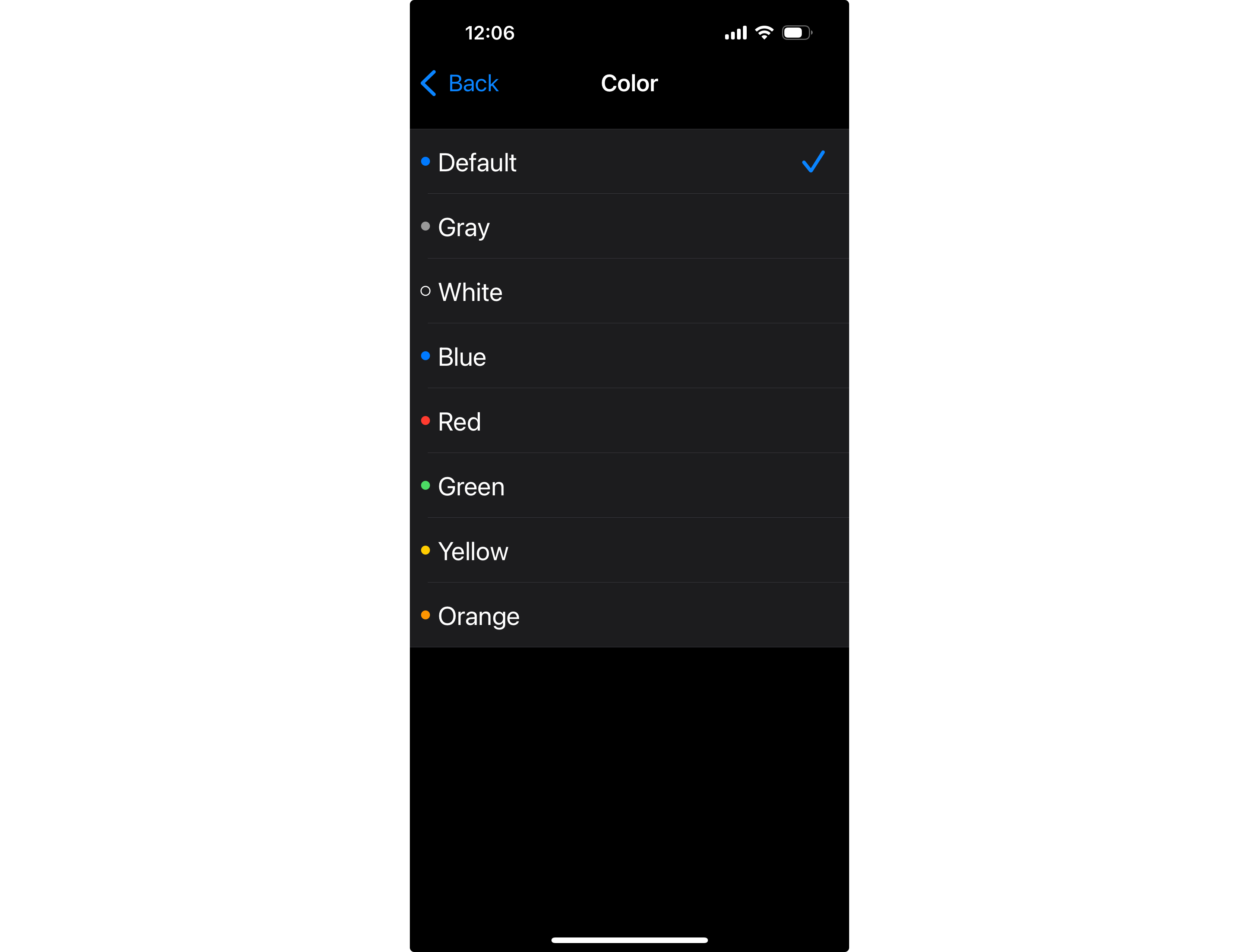
On iOS, the system draws the keyboard focus indicator, and developers have little control over it. When the indicator's color is too close to an element's own colors, users can change it on their device: open Settings > Accessibility > Keyboards > Full Keyboard Access > Color, and choose a color with better contrast.
Pass Patterns
Android
XML Views
The background selector adds a dashed outline in the focused state, so the focused button looks different.
<!-- res/drawable/button_background.xml -->
<selector xmlns:android="http://schemas.android.com/apk/res/android">
    <item android:state_focused="true">
        <layer-list>
            <item>
                <shape android:shape="rectangle">
                    <stroke
                        android:width="1dp"
                        android:color="#000000"
                        android:dashWidth="4dp"
                        android:dashGap="2dp" />
                    <solid android:color="@android:color/transparent" />
                    <corners android:radius="4dp" />
                </shape>
            </item>
            <item android:bottom="2px" android:left="2px" android:right="2px" android:top="2px">
                <shape android:shape="rectangle">
                    <solid android:color="#DDDDDD" />
                    <corners android:radius="4dp" />
                </shape>
            </item>
        </layer-list>
    </item>
    <item>
        <layer-list>
            <item android:bottom="2px" android:left="2px" android:right="2px" android:top="2px">
                <shape android:shape="rectangle">
                    <solid android:color="#DDDDDD" />
                    <corners android:radius="4dp" />
                </shape>
            </item>
        </layer-list>
    </item>
</selector><Button
android:layout_width="wrap_content"
android:layout_height="wrap_content"
android:background="@drawable/button_background"
android:backgroundTint="@null"
android:text="Save"
android:textColor="#000000" />Fail Patterns
Android
XML Views
The background selector uses the same color for the focused and the default states, so focus is not visible.
<!-- res/drawable/button_background.xml -->
<selector xmlns:android="http://schemas.android.com/apk/res/android">
    <item android:state_focused="true">
        <shape android:shape="rectangle">
            <solid android:color="#DDDDDD" />
            <corners android:radius="4dp" />
        </shape>
    </item>
    <item>
        <shape android:shape="rectangle">
            <solid android:color="#DDDDDD" />
            <corners android:radius="4dp" />
        </shape>
    </item>
</selector><Button
android:layout_width="wrap_content"
android:layout_height="wrap_content"
android:background="@drawable/button_background"
android:backgroundTint="@null"
android:text="Save"
android:textColor="#000000" />Try It Yourself
Using a keyboard
- Connect an external keyboard to the device. On iOS, also turn on Settings > Accessibility > Keyboards > Full Keyboard Access.
- Press Tab, or use the arrow keys, to move keyboard focus through the screen.
- Check whether each element clearly shows when it has focus.
Expected results: Every focused element shows a clear, visible focus indicator.
Actual results: Some elements receive focus without any visible change, or the change is too faint to notice.
FAQ
How does this issue relate to 2.4.7 Focus Visible?
SC 2.4.7 requires that any keyboard-operable interface has a mode of operation where the keyboard focus indicator is visible. When an element shows no visible change when it receives focus, or the change is too faint to notice, keyboard users cannot perceive where focus is, so the criterion is not met.
Why is this issue marked as Serious?
Without a visible focus indicator, keyboard users cannot tell which element is active. They may lose their place, activate the wrong control, or be unable to complete key tasks, so it is rated serious.
Standards and Regulations
| Standard | Success Criterion | Reference |
|---|---|---|
| WCAG 2.2 | 2.4.7 Focus Visible (AA) | Any keyboard-operable user interface has a mode of operation where the keyboard focus indicator is visible. |
| EN 301 549 | 11.2.4.7 Focus Visible | Same as the WCAG text. |
| Section 508 | 1194.21(c) | A well-defined on-screen indication of the current focus shall be provided that moves among interactive interface elements as the input focus changes. The focus shall be programmatically exposed so that assistive technology can track focus and focus changes. |