overlapping-controls
Mobile validation
Small or overlapping touch targets make it hard to activate the intended control. People with motor disabilities, such as hand tremors, or with low vision may miss the control, activate the wrong one, or need several attempts. Controls can overlap, but the part of each control that remains exposed must still be large enough to tap. Make sure the exposed area of an overlapped control is at least 24 by 24 pixels.
Note: The platform guidelines recommend larger touch targets: at least 44 by 44 points on iOS, and 48 by 48 dp on Android. These are closer to the 44 by 44 pixels of SC 2.5.5 Target Size (Enhanced), level AAA. This validation can be configured to check either threshold, according to your organization's accessibility guidelines.
Pass Patterns
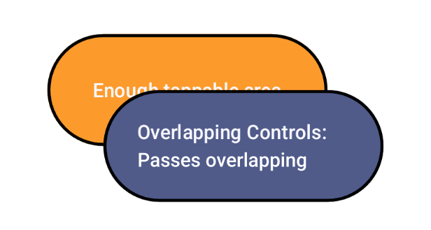
Overlapped control with enough exposed area
The blue button overlaps part of the orange button, but enough of the orange button remains exposed to tap it reliably.
Fail Patterns
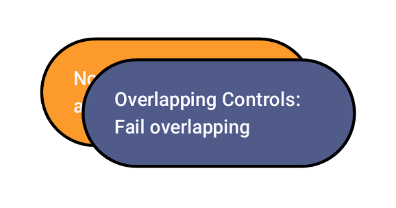
Overlapped control with too little exposed area
The blue button covers almost all of the orange button, so only a thin edge of the orange button remains exposed, and it is too small to tap.
Try It Yourself
Checking the touch targets
- Find controls that overlap other controls.
- Measure the size of the overlapped control, and the size of the area that remains exposed.
Expected results: The exposed area of each overlapped control is at least 24 by 24 pixels, or the size your organization's guidelines require.
Actual results: The exposed area of an overlapped control is smaller than the required size.
Using iOS developer tools
In Xcode, open Xcode > Open Developer Tool > Accessibility Inspector, select the simulator or device, and point at each control to see its frame.
Expected results: Each control's frame leaves enough exposed area.
Actual results: A control is mostly covered by another.
FAQ
How does this issue relate to 2.5.5 Target Size (Enhanced)
WCAG 2.5.5 Target Size (Enhanced) at level AAA sets a larger minimum target size. When interactive elements overlap, the exposed, tappable area can drop below that size. This validation relates to 2.5.5 by identifying overlaps that leave too little exposed area to reliably activate the intended control.
It evaluates overlap based on the part of each control that remains exposed. If that exposed area is below the configured minimum, the control may not meet 2.5.5, even if its visual bounds are larger. By default it checks for at least 24 by 24 pixels, or a larger size if configured.
This validation helps you:
- measure the exposed tappable area of overlapped controls
- compare it against 24 by 24 pixels or a larger configured size such as 44 by 44 pixels
- surface controls that are easy to miss or activate by mistake
Note: Platform guidelines recommend larger sizes: at least 44 by 44 points on iOS and 48 by 48 dp on Android. These are close to the 44 by 44 pixels referenced in 2.5.5. You can configure this validation to use the threshold your organization requires.
How does this issue relate to 2.5.8 Target Size (Minimum)?
This issue maps directly to 2.5.8 Target Size (Minimum). The criterion requires each pointer target to be at least 24 by 24 CSS pixels, or to have enough spacing that users can reliably activate the intended control. When controls are too small or overlap, the effective target becomes smaller and ambiguous, which can lead to missed activations, accidental activations, or repeated attempts.
To meet 2.5.8 for these cases, ensure that each interactive element either:
- Meets the 24 by 24 CSS pixel minimum size
- Has sufficient spacing so hit areas do not overlap
Why is this issue marked as Serious?
When a control is mostly covered, users may be unable to activate it, or may activate the overlapping control by mistake. This can block tasks, especially for people with motor disabilities or low vision, so it is rated serious.
Standards and Regulations
| Standard | Success Criterion | Reference |
|---|---|---|
| WCAG 2.2 | 2.5.5 Target Size (Enhanced) (AAA) | The size of the target for pointer inputs is at least 44 by 44 CSS pixels, except where an equivalent target is available, the target is inline, the target's size is determined by the user agent and not modified by the author, or a specific presentation of the target is essential. |
| WCAG 2.2 | 2.5.8 Target Size (Minimum) (AA) | The size of the target for pointer inputs is at least 24 by 24 CSS pixels, except where an equivalent target is available, the target is inline, a specific presentation of the target is essential, or the target's size is determined by the user agent and not modified by the author. |
| EN 301 549 | 11.2.5.5 Target Size (Enhanced) | Same as the WCAG text. |
| EN 301 549 | 11.2.5.8 Target Size (Minimum) | Same as the WCAG text. |
Personas impacted by this issue
Learn More
- Visual Design: Adaptivity and Layout (Apple Human Interface Guidelines)
- Android Accessibility Help: Touch target size
- Understanding Success Criterion 2.5.8: Target Size (Minimum)
- "What is px? What is a pt? What is dp?" - Blog post by Porag Gogoi
- Apple Human Interface Guidelines: Accessibility