tappable-area
Mobile validation
Small touch targets make it hard to activate controls accurately, especially for people with hand tremors, limited fine motor control, or low vision. Make each touch target at least 24 by 24 pixels, or leave enough space around smaller targets, so that a 24-pixel circle centered on each target does not overlap another target or its circle. Larger targets, or more space between them, reduce accidental activation.
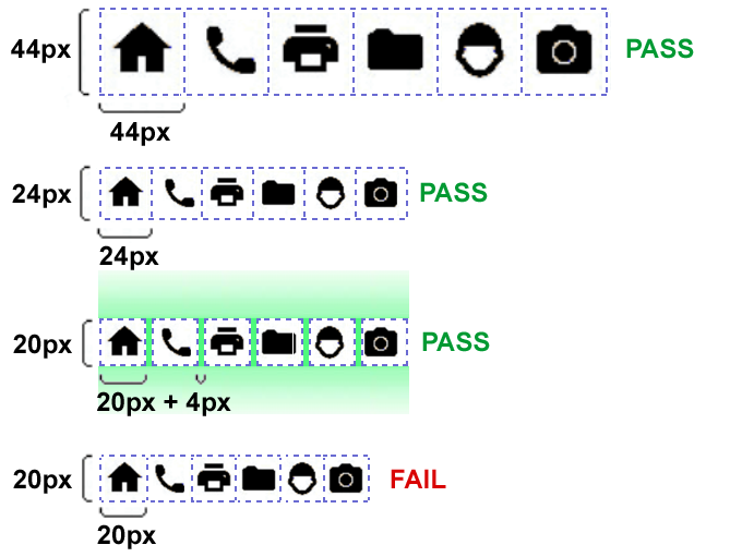
The figure above is from the W3C's Understanding Success Criterion 2.5.8: Target Size (Minimum).
Note: The platform guidelines recommend larger touch targets: at least 44 by 44 points on iOS, and 48 by 48 dp on Android. These are closer to the 44 by 44 pixels of SC 2.5.5 Target Size (Enhanced), level AAA. By default, this validation checks the equivalent of the 24 by 24 pixel minimum. It can be configured to check the platform sizes without spacing, or a custom size, according to your organization's accessibility guidelines.
Pass Patterns
Android
The button is 48dp tall, which meets the minimum target size.
<Button
    android:layout_width="wrap_content"
    android:layout_height="48dp"
    android:text="Play" />
The button is 48dp tall, which meets the minimum target size.
Button(
    onClick = play,
    modifier = Modifier.height(48.dp),
) {
    Text(text = "Play")
}
iOS
The button is 24 points tall, which meets the minimum target size.
let playButton = UIButton(type: .system)
playButton.setTitle("Play", for: .normal)
playButton.heightAnchor.constraint(equalToConstant: 24).isActive = true Button {
...
} label: {
Text("Submit")
.frame(height: 44)
// Note: not applied to the button frame, but the contents
}
.buttonStyle(.borderedProminent)
.accessibilityLabel("Submit the form")Cross Platform
The tappable area is 48 pixels tall, which meets the minimum target size.
Semantics(
  label: 'Play',
  button: true,
  child: InkWell(
    onTap: play,
    child: const SizedBox(
      height: 48,
      child: Padding(
        padding: EdgeInsets.symmetric(horizontal: 16),
        child: Icon(Icons.play_arrow),
      ),
    ),
  ),
),
The pressable is 48 pixels tall, which meets the minimum target size.
<Pressable
  accessibilityRole="button"
  style={{ height: 48, paddingHorizontal: 16 }}
  onPress={play}
>
  <Text>Play</Text>
</Pressable>
Fail Patterns
Android
The button is only 20dp tall, below the minimum target size.
<Button
    android:layout_width="wrap_content"
    android:layout_height="20dp"
    android:text="Play" />
The button is drawn only 20dp tall, below the minimum target size. Compose can extend its touch area to 48dp, but users can't see the extension, and it shrinks when a neighboring target overlaps it.
Button(
    onClick = play,
    modifier = Modifier.height(20.dp),
) {
    Text(text = "Play")
}
iOS
The button is only 20 points tall, below the minimum target size.
let playButton = UIButton(type: .system)
playButton.setTitle("Play", for: .normal)
playButton.heightAnchor.constraint(equalToConstant: 20).isActive = true
The button is only 20 points tall, below the minimum target size. A plain button adds no padding around its label, so the label's height is the button's.
Button {
    submit()
} label: {
    Text("Submit")
        .frame(height: 20)
}
.buttonStyle(.plain)
Cross Platform
The tappable area is only 20 pixels tall, below the minimum target size.
Semantics(
  label: 'Play',
  button: true,
  child: InkWell(
    onTap: play,
    child: const SizedBox(
      height: 20,
      child: Padding(
        padding: EdgeInsets.symmetric(horizontal: 16),
        child: Icon(Icons.play_arrow),
      ),
    ),
  ),
),
The pressable is only 20 pixels tall, below the minimum target size.
<Pressable
  accessibilityRole="button"
  style={{ height: 20, paddingHorizontal: 16 }}
  onPress={play}
>
  <Text>Play</Text>
</Pressable>
Try It Yourself
Using a stylus or a fingertip
- Tap different points within the control, including its edges, not only its text or icon.
- Check whether the control is activated wherever you tap within its target.
Expected results: The control is activated anywhere within a target of at least 24 by 24 pixels, or the size your organization's guidelines require.
Actual results: The control is activated only on its text or icon, or its target is smaller than the required size, so activation is unreliable.
Using iOS developer tools
In Xcode, open Xcode > Open Developer Tool > Accessibility Inspector, select the simulator or device, and point at the control to see its frame.
Expected results: The control's frame meets the required size.
Actual results: The control's frame is smaller than the required size.
FAQ
How does this issue relate to 2.5.5 Target Size (Enhanced)?
WCAG 2.5.5 Target Size (Enhanced) expects larger targets than 2.5.8. While 2.5.8 allows a 24 by 24 pixel target when there is enough spacing so 24‑pixel circles do not overlap, 2.5.5 calls for targets that are about 44 by 44 pixels.
By default, this validation checks the equivalent of the 24 by 24 pixel minimum of 2.5.8. You can configure it to check the platform-recommended sizes without spacing, or a custom size. The iOS 44 by 44 points and Android 48 by 48 dp recommendations are closer to 2.5.5.
How does this issue relate to 2.5.8 Target Size (Minimum)?
This issue maps to WCAG 2.5.8 because it focuses on the minimum target size for pointer inputs. The criterion requires targets to be at least 24 by 24 CSS pixels.
When targets are smaller, people with hand tremors or limited fine motor control can struggle to activate the intended control. Increasing target size and adding spacing between adjacent targets reduces accidental activation and supports the intent of 2.5.8.
Why is this issue marked as Serious?
Small touch targets make common actions, such as navigating and submitting forms, hard to complete and easy to get wrong. People with motor disabilities or low vision may miss the target, activate the wrong one, or need several attempts, which can cause errors, delays, and abandoned tasks, so it is rated serious.
Standards and Regulations
| Standard | Success Criterion | Reference |
|---|---|---|
| WCAG 2.2 | 2.5.5 Target Size (Enhanced) (AAA) | The size of the target for pointer inputs is at least 44 by 44 CSS pixels, except where an equivalent target is available, the target is inline, the target's size is determined by the user agent and not modified by the author, or a specific presentation of the target is essential. |
| WCAG 2.2 | 2.5.8 Target Size (Minimum) (AA) | The size of the target for pointer inputs is at least 24 by 24 CSS pixels, except where an equivalent target is available, the target is inline, a specific presentation of the target is essential, or the target's size is determined by the user agent and not modified by the author. |
| EN 301 549 | 11.2.5.5 Target Size (Enhanced) | Same as the WCAG text. |
| EN 301 549 | 11.2.5.8 Target Size (Minimum) | Same as the WCAG text. |
Personas impacted by this issue
Learn More
- "Visual Design > Adaptivity and Layout" - Apple Human Interface Guidelines
- Android Accessibility Help: Touch target size
- Understanding Success Criterion 2.5.8: Target Size (Minimum)
- "What is px? What is a pt? What is dp?" - By Porag Gogoi on Medium
- Apple Human Interface Guidelines: Accessibility