accessible-name
Web validation
An accessible name is the text that assistive technology uses to identify a component's purpose. Buttons, links, form controls, and other interactive elements all need one, and this validation checks disabled controls too.
The name comes from the computed accessible name. Common sources include aria-labelledby, aria-label, alt, title, a native label, button text, and visible text content.
When an element has no accessible name, assistive technology may announce only a role, such as “button” or “edit text”. That leaves users without enough information to understand or operate the control.
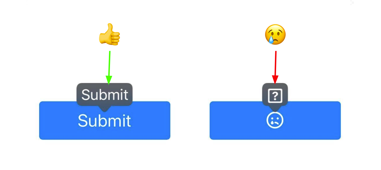
Voice control software also relies on the accessible name: it's the phrase users say to activate a control. In the example below, the voice control software labels the named button "Submit", but can only mark the unnamed button with a question mark.
Pass Patterns
Button with visible text
The visible text gives the button a programmatically determinable accessible name.
<button type="button">Save changes</button>Icon button named with aria-label
The aria-label names the icon-only button, since its visible content is hidden from assistive technology.
<button type="button" aria-label="Open settings">
    <svg aria-hidden="true" focusable="false"></svg>
</button>
Form field with an associated label
The <label> is linked to the input through for and id, so the field has an accessible name.
<label for="email">Email address</label>
<input id="email" type="email" />
Fail Patterns
Icon-only button with no name
The only content is an aria-hidden icon, so the button exposes no accessible name.
<button type="button">
    <svg aria-hidden="true" focusable="false"></svg>
</button>
Icon-only link with no name
The link contains only a hidden icon and no text, so it exposes no accessible name.
<a href="/settings">
    <svg aria-hidden="true" focusable="false"></svg>
</a>
Form field with no label
The text input has no associated <label>, aria-label, or aria-labelledby, so it has no accessible name.
<input type="text" />WCAG techniques
Sufficient techniques
- ARIA14: Using aria-label to provide an accessible name where a visible label cannot be used
- ARIA16: Using aria-labelledby to provide a name for user interface controls
- G108: Using markup features to expose the name and role, allow user-settable properties to be directly set, and provide notification of changes
- H44: Using label elements to associate text labels with form controls
- H65: Using the title attribute to identify form controls when the label element cannot be used
- H91: Using HTML form controls and links
Failure techniques
ACT Rules
- Button has non-empty accessible name
- Link has non-empty accessible name
- Form field has non-empty accessible name
Try It Yourself
Using a screen reader
New to screen reader testing, or need a refresher?
Review this article first: Practical guides for using screen readers
- Load the page and open a screen reader.
- Move to the target control.
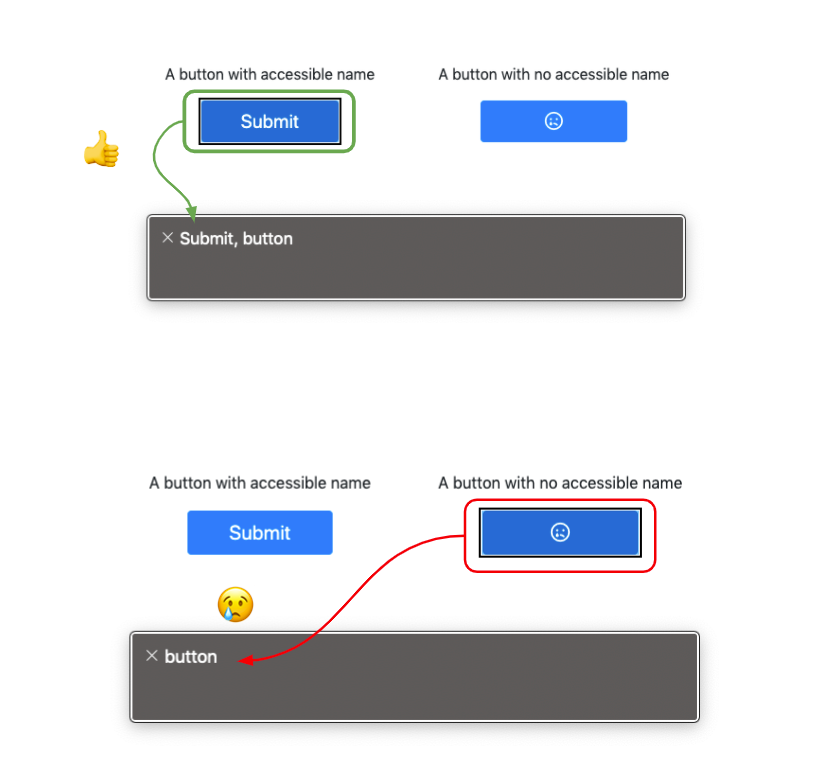
- Listen to the name and role that are announced.
Expected results: The screen reader announces a clear name and role, such as “Save changes, button”.
Actual results: The screen reader announces only a role, an unclear symbol, or no useful name.
Inspecting the browser dev-tools
- Inspect the target element in your browser's dev tools.
- Open the Accessibility panel.
- Check the computed Name value for the element.
Expected results: The computed Name value contains text that identifies the element's purpose.
Actual results: The computed Name value is empty or does not identify the element's purpose.
FAQ
How does this issue relate to 4.1.2 Name, role, value?
SC 4.1.2 requires user interface components to expose a name that can be programmatically determined. When a button, link, or form control has no accessible name, assistive technology cannot reliably identify its purpose.
Why is this issue marked as Critical?
Users may be unable to tell what an interactive element does before using it. A missing accessible name can block key tasks, especially when the element submits data, closes a dialog, or controls important page behavior.
Standards and Regulations
| Standard | Success Criterion | Reference |
|---|---|---|
| WCAG 2.2 | 4.1.2 Name, Role, Value (A) | For all user interface components, the name and role can be programmatically determined; states, properties, and values that can be set by the user can be programmatically set; and notification of changes to these items is available to assistive technologies. |
| EN 301 549 | 9.4.1.2 Name, Role, Value | Same as the WCAG text. |
| Section 508 | 1194.21(d) | Sufficient information about a user interface element including the identity, operation and state of the element shall be available to assistive technology. When an image represents a program element, the information conveyed by the image must also be available in text. |
| 508 Trusted Tester | 2.4.4-link-purpose, 6.A | The purpose of each link or button can be determined from any combination of the link/button text, accessible name, accessible description, and/or programmatically determined link/button context. |
| 508 Trusted Tester | 1.3.1-programmatic-label, 5.C | The combination of the accessible name, accessible description, and other programmatic associations (e.g., table column and/or row associations) describes each input field and includes all relevant instructions and cues (textual and graphical). |