Combobox
UI pattern
combobox role and a name, is one tab stop with its popup, reports whether the popup is open, and identifies the active and selected options.A combobox's popup is hidden until users open it, and in the most common case it's a listbox of options to choose from. It can also be a grid, a tree, or a dialog. This entry covers the listbox popup.
A combobox is either editable or select-only. In an editable combobox, users type into a text field. The options in the popup are either suggestions they can accept or ignore, or a fixed set of allowed values that their typing filters. A select-only combobox displays its value, and choosing an option from the popup is the only way to change it. The HTML <select> element is this kind.
Unless the popup is a dialog, keyboard focus stays on the combobox while users make a selection from the popup. Users move through the popup with the arrow keys, and aria-activedescendant on the combobox tells assistive technology which option is active. A dialog popup is the exception: focus moves into it and returns to the combobox when it closes.
Many editable comboboxes offer autocompletion, where what users type narrows the options in the popup, fills in the rest of a suggested value, or does both.
Related Patterns lists other patterns that open a popup or offer a choice.
Note: Combobox implementations vary widely, as the APG Combobox Pattern notes, and no single recipe covers them all. Build one from what users need to perceive and operate, starting from the native comboboxes, which set users' expectations.
When to Use
Use a combobox when:
- Users set one value from a set of options, and the page has room for the value but not the whole list.
- Typing a few characters to narrow a long list, such as a list of countries, is faster than scrolling through it.
- Any value is allowed, but suggestions save users time, such as a search field that offers earlier searches.
Do not use a combobox when:
- The options are commands that run when chosen. Use a menu button to open a menu.
- The options are few enough to show all at once. Use a radio group or a listbox.
- Users choose more than one value. Use a multi-select listbox or a group of checkboxes.
- The popup holds content other than choices for the field's value. Use a button that opens a dialog.
Examples
Code in this section is meant to demonstrate techniques rather than requirements and lacks features needed in a production application.
The examples ask users to choose an ice cream flavor or a favorite pet. The first two are native comboboxes the browser builds and operates. The third reproduces the first with ARIA, CSS, and script. For how to build a listbox of its own, refer to Listbox, and for more combobox variations, see the examples in the APG Combobox Pattern.
Native Input With Datalist
An <input> of type text, the default, becomes an editable combobox when its list attribute references a <datalist> element. The <option> elements in the <datalist> are suggestions users can accept or not. No ARIA is needed: assistive technology reports an editable combobox with a popup of suggestions, along with its state and position as users operate it.
The browser supplies the keyboard and pointer behavior. Typing shows only the options containing what's been typed. The Down Arrow key opens the popup and moves through it, Enter chooses the highlighted option and closes the popup without submitting the form, and Escape closes the popup without choosing, in most browsers. Moving through the options highlights them without selecting, so users can leave the popup with the field unchanged.
Browsers differ in the details. Some open the popup when the field receives focus and some don't, and Chrome and Edge show a dropdown arrow on hover or focus. On a mobile device, the options can appear as buttons above the on-screen keyboard instead of in a popup. Support is uneven in places, including Firefox on Android and options that don't grow with page zoom, so test the element on the platforms you support.
Native input with datalist HTML
<label for="ice-cream-choice">
  Choose an ice cream flavor:
</label>
<input
  id="ice-cream-choice"
  type="text"
  name="ice-cream-choice"
  list="ice-cream-flavors">
<datalist id="ice-cream-flavors">
  <option>Butter Pecan</option>
  <option>Chocolate</option>
  <option>Cookies and Cream</option>
  <option>Strawberry</option>
  <option>Tutti Frutti</option>
  <option>Vanilla</option>
</datalist>
Native Select
A <select> element with <option> children is a select-only combobox with a listbox popup, as long as it has no multiple attribute and no size greater than 1. It isn't editable. Its value comes from the first option whose selected property is true, or is the empty string when none is. The selected attribute only sets that property's starting value.
How a <select> behaves as a combobox depends on the platform. On Windows, NVDA and JAWS report a combobox with a listbox popup. Selection follows focus, so the value changes as the arrow keys move through the options, and Escape doesn't restore the earlier value. The Down Arrow key changes the value without opening the popup, and Space opens it.
On macOS, VoiceOver reports a button with a menu popup. Selection doesn't follow focus, so users choose an option explicitly, and Escape closes the popup and keeps the earlier value. The Down Arrow key and Space both open the popup. On both platforms, typing a character moves to the first option that starts with it, without opening the popup.
Native select HTML
<label for="favorite-pet">Your favorite pet</label>
<select id="favorite-pet" name="pets">
  <option value="">--Please select--</option>
  <option>Dog</option>
  <option>Cat</option>
  <option>Chinchilla</option>
  <option>Hamster</option>
  <option>Parrot</option>
  <option>Spider</option>
</select>
Custom Combobox With List Autocomplete
A custom combobox with the behavior of an <input> and <datalist> needs ARIA to report what it is, CSS to show its states, and script to change them. Here, users choose an ice cream flavor from suggestions that narrow as they type.
In the illustration, a user has typed the letter "c", which narrows the options to Butter Pecan, Chocolate, and Cookies and Cream, and then pressed the Down Arrow key to highlight Chocolate.
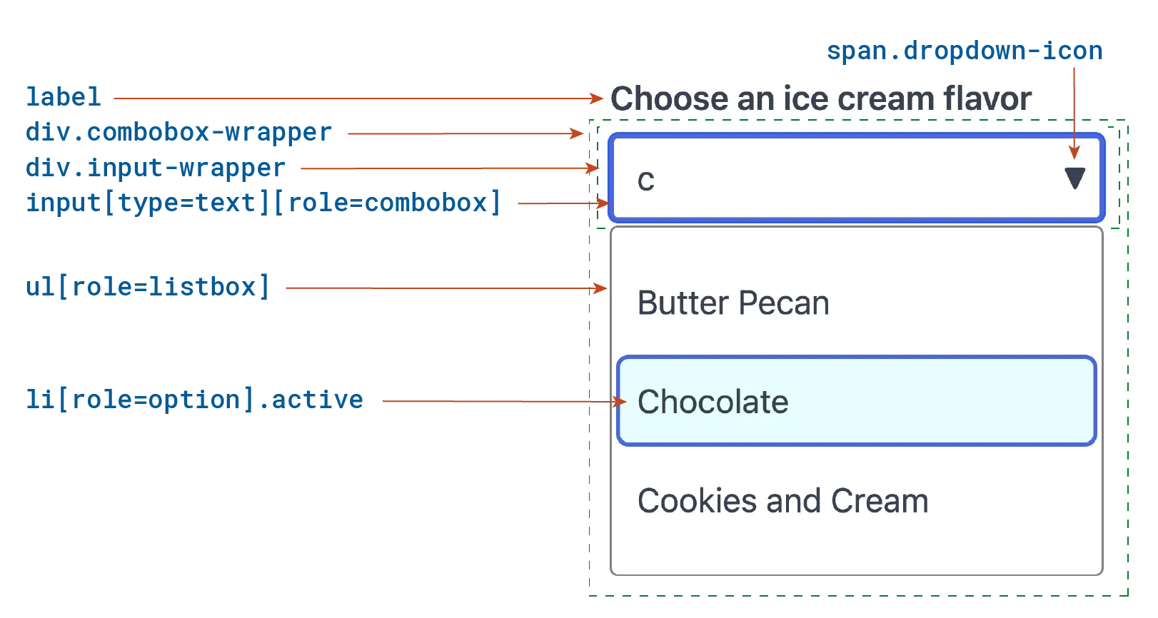
The input has the combobox role and takes its accessible name from its <label>. Its aria-autocomplete value of list says typing narrows the popup, aria-controls references the popup, aria-expanded reports whether it's open, and aria-activedescendant holds the id of the highlighted option. The popup has the listbox role and takes its name from the same label, and each option has the option role and an aria-selected state.
The input's autocomplete="off" keeps the browser from opening its own list of earlier entries on top of the popup. The dropdown icon is only a visual cue, hidden from assistive technology: clicking or tapping the field itself opens the popup.
Custom combobox HTML
<label id="cbx-label" for="cbx-input">
  Choose an ice cream flavor:
</label>
<div class="combobox-wrapper">
  <div class="input-wrapper">
    <input
      id="cbx-input"
      type="text"
      name="ice-cream-choice"
      role="combobox"
      autocomplete="off"
      aria-autocomplete="list"
      aria-controls="cbx-listbox"
      aria-expanded="true"
      aria-activedescendant="cbx-option-1"
      value="c">
    <span class="dropdown-icon" aria-hidden="true">▼</span>
  </div>
  <ul
    id="cbx-listbox"
    class="open"
    role="listbox"
    aria-labelledby="cbx-label">
    <li
      id="cbx-option-0"
      role="option"
      aria-selected="false">
      Butter Pecan
    </li>
    <li
      id="cbx-option-1"
      class="active"
      role="option"
      aria-selected="false">
      Chocolate
    </li>
    <li
      id="cbx-option-2"
      role="option"
      aria-selected="false">
      Cookies and Cream
    </li>
  </ul>
</div>
Most of the CSS is styling, but four rules carry the combobox's accessibility: the :focus and :hover rules that make focus and hover visible, [role=listbox].open, which shows the popup, and [role=option].active, which shows the highlighted option. The input keeps keyboard focus, so :focus never applies to an option, and the active class is what shows users where they are.
Custom combobox CSS
.combobox-wrapper {
  position: relative;
  max-width: 320px;


  .input-wrapper {
    position: relative;
    display: flex;
    align-items: center;
  }


  input {
    display: block;
    width: 100%;
    padding: 8px 48px 8px 12px;
    outline: 1px solid gray;
    outline-offset: -1px;
    border-radius: 4px;
    background: #fff;
  }


  input + .dropdown-icon {
    display: none;
    position: absolute;
    right: 0.5em;
    pointer-events: none;
  }


  input:focus {
    outline: 2px solid royalblue;
    outline-offset: -2px;
  }


  input:focus + .dropdown-icon,
  input:hover + .dropdown-icon {
    display: block;
  }


  ul[role=listbox] {
    position: absolute;
    display: none;
    width: 100%;
    margin-top: 2px;
    padding: 8px 4px;
    background: white;
    border: 1px solid gray;
    border-radius: 4px;
    z-index: 10;
    list-style: none;
  }


  ul[role=listbox].open {
    display: block;
  }


  [role=option] {
    padding: 4px 8px;
    border-radius: 4px;
    font-size: 16px;
    line-height: 2;
  }


  [role=option].active,
  [role=option]:hover {
    background: lightcyan;
    outline: solid 1px royalblue;
  }
}
The script, left out here, filters the popup to the options containing what's been typed, ignoring case. With nothing typed, the popup shows every option, and with no match, it doesn't open. As users interact, the script changes the markup:
- Opening the popup adds the
openclass to the listbox and setsaria-expanded="true"on the input. - Highlighting an option adds the
activeclass to it and sets the input'saria-activedescendantto itsid. - Selecting an option sets its
aria-selectedtotrue, puts its text in the input, and closes the popup. - Closing the popup removes the
openclass, setsaria-expanded="false", removesaria-activedescendant, and removes theactiveclass from the highlighted option.
In this example, selection doesn't follow focus, so highlighting an option doesn't select it. Selection happens when users press Enter on the highlighted option or release the pointer over it, so they can move through the options, or press Escape, without changing the value. Operation lists the keys the script handles.
Structure and Semantics
A combobox has two parts: the element with the combobox role, which holds the value and keeps keyboard focus, and the popup it controls. A <select>, or an <input> with a list attribute, has the role implicitly, and the browser supplies the popup and every state below, so it needs no ARIA. In a custom combobox, the element that takes focus, an <input> for an editable combobox, declares the combobox role.
The popup carries the role of the widget it is: listbox, grid, tree, or dialog. An item that users can choose carries the role according to the widget's pattern, such as option in a listbox, gridcell in a grid, or treeitem in a tree. A dialog popup is operated through its own tab order, with each control in it carrying the role for what it does.
A combobox can be a form control, with a form name and a value that a form submits, separate from its accessible name. To make one, build the combobox element from an <input> without the multiple attribute, a <button>, or a <select>, or make it a form-associated custom element. Setting an accessible name doesn't set the name property, and the two usually hold different text.
Each part of a custom combobox carries these attributes.
Combobox element attributes
| Attribute | How to use |
|---|---|
role | Set to "combobox" on the element that takes focus and holds the value. |
aria-expanded | Required. Set on the combobox to true while the popup is visible and false while it's hidden. |
aria-controls | Set on the combobox to the id of the popup. |
aria-haspopup | Optional for a listbox popup, the combobox role's default. Set it to grid, tree, or dialog to match any other popup. |
aria-autocomplete | Editable combobox only. Set to list, inline, or both to match how typing helps users complete their entry. |
aria-activedescendant | Set on the combobox to the id of the active option while the popup is open, and clear it when no option is active. |
aria-required | Set to true on the combobox when users have to supply a value. |
aria-invalid and aria-errormessage | Editable combobox only. When the entry is rejected as invalid, set aria-invalid="true" on the combobox and point aria-errormessage at a message suggesting a correction, when one is known. |
aria-disabled | Set to true on a custom combobox that isn't available. Use the disabled attribute on an <input> or <select>. |
Listbox popup attributes
| Attribute | How to use |
|---|---|
role | Set to "listbox". |
id | A unique id that the combobox's aria-controls references. |
aria-labelledby | Set on the listbox popup to the id of the combobox's label. |
Option attributes
| Attribute | How to use |
|---|---|
role | Set to "option" on each option. |
id | A unique id that the combobox's aria-activedescendant can reference. |
aria-selected | Set to true on the option holding the combobox's value and false on every other selectable option. |
aria-disabled | Set to true on an option that can't be selected. |
Combobox Has Options
A combobox holds the options it offers. A <select> contains <option> elements, and so does the <datalist> an input's list attribute references, while a custom combobox's listbox contains elements with the option role. The popup opens only when there's something in it to choose, which matters when typing filters the options down to none.
Contains options to choose from
Reported as: Empty data-list
A combobox must contain at least one option.
When a <select>, the <datalist> an input references, or a custom combobox's listbox has no options, users reach a field presented as a set of choices and find nothing to choose. Screen reader users get no announcement explaining the empty list, and a required field can't be completed.
Fill the list before the combobox is offered, and keep the field disabled until options that load separately arrive. When a set can be empty, say so beside the field, and handle a failed request as its own case rather than as an empty list.
Severity: Critical
| Standard | Success Criterion | Reference |
|---|---|---|
| WCAG 2.2 | 1.3.1 Info and Relationships (A) | Information, structure, and relationships conveyed through presentation can be programmatically determined or are available in text. |
| EN 301 549 | 9.1.3.1 Info and Relationships | Same as the WCAG text. |
Listbox Has Options
A combobox's listbox popup contains at least one option that users can choose, and every group in it contains at least one option. Options sit directly inside the listbox or inside a group, and any other element inside the listbox, such as a group's heading, has role="none".
Offers at least one choice
Reported as: No active options
A combobox's popup must have at least one option that isn't disabled.
When every option in the popup is disabled, keyboard and screen reader users move through the list and find nothing they can accept. They can't tell whether they missed the usable option, the combobox is broken, or there's no choice to make.
Keep at least one option available. When nothing can be chosen, disable the combobox itself, and say next to it why there's nothing to pick.
Severity: Critical
| Standard | Success Criterion | Reference |
|---|---|---|
| WCAG 2.2 | 2.1.1 Keyboard (A) | All functionality of the content is operable through a keyboard interface without requiring specific timings for individual keystrokes, except where the underlying function requires input that depends on the path of the user's movement and not just the endpoints. |
| EN 301 549 | 9.2.1.1 Keyboard | Same as the WCAG text. |
| Section 508 | 1194.21(a) | When software is designed to run on a system that has a keyboard, product functions shall be executable from a keyboard where the function itself or the result of performing a function can be discerned textually. |
| 508 Trusted Tester | 2.1.1-keyboard-access, 4.A | All functionality can be accessed and executed using only the keyboard. |
Gives members the required role
Reported as: No group members with required role
A combobox's listbox popup, and each group in it, must contain elements with the option role.
When the popup's children are generic elements, or extra wrappers sit between the listbox and its options, assistive technology finds no options to report. The combobox's aria-activedescendant then points at elements that aren't options, and screen reader users hear the highlighted text with no role, count, or position.
Give each option role="option" and make it a child of the listbox or of a group. Remove any wrapper between them, or give the wrapper role="none".
Severity: Serious
| Standard | Success Criterion | Reference |
|---|---|---|
| WCAG 2.2 | 1.3.1 Info and Relationships (A) | Information, structure, and relationships conveyed through presentation can be programmatically determined or are available in text. |
| EN 301 549 | 9.1.3.1 Info and Relationships | Same as the WCAG text. |
Role
The element that takes focus and holds the value carries the combobox role, and its popup carries listbox or the role of whichever widget it is. A <select>, and an <input> with a list attribute, have the combobox role natively. A custom combobox declares role="combobox" on the input itself. ARIA 1.1 put the role on a wrapper around a text field, but that construction had little support and isn't valid in ARIA 1.2.
Has the correct role
Reported as: Element has incorrect role
A custom combobox must carry role="combobox", and its popup must carry the role of the widget it is, such as listbox.
When an input that opens suggestions has no role, assistive technology reports a plain text field, so users type without knowing a list of options exists or that the arrow keys reach it. When the popup has no role, its options aren't reported as choices at all.
Add role="combobox" to the input and role="listbox" to the popup, or use a <select> or an <input> with a <datalist>, which carry the roles natively.
Severity: Critical
| Standard | Success Criterion | Reference |
|---|---|---|
| WCAG 2.2 | 4.1.2 Name, Role, Value (A) | For all user interface components, the name and role can be programmatically determined; states, properties, and values that can be set by the user can be programmatically set; and notification of changes to these items is available to assistive technologies. |
| EN 301 549 | 9.4.1.2 Name, Role, Value | Same as the WCAG text. |
| Section 508 | 1194.21(d) | Sufficient information about a user interface element including the identity, operation and state of the element shall be available to assistive technology. When an image represents a program element, the information conveyed by the image must also be available in text. |
Applies role to the correct element
Reported as: Incorrect root element
Sanity check. Evinced checks that the combobox role sits on the element that receives keyboard focus. This check runs on every UI pattern, not only on comboboxes.
A custom combobox should carry the combobox role on the element that receives focus, not on a wrapper around it.
When the role sits on a container around the input, as ARIA 1.1 prescribed, assistive technology reports the focused input without it. Users land in a text field with no word that it has a popup, and the combobox's aria-expanded and aria-activedescendant describe an element that never has focus.
Put the role, the accessible name, aria-expanded, aria-controls, and aria-activedescendant on the input, and keep any layout wrapper free of roles.
Accessibility Label
A combobox has an accessible name that says which value it sets, such as "Choose an ice cream flavor". An <input> or <select> takes it from an associated <label>. A custom combobox built from another element points aria-labelledby at its visible label or, when there's none, uses aria-label.
The popup listbox needs a name too, and the simplest one to give it is the same label, through aria-labelledby, so the field and its popup describe the same choice.
Names the combobox
Reported as: Missing contextual labeling
A combobox must have an accessible name that says which choice it offers.
When the combobox has no name, screen reader users hear "combobox" and a value with nothing to say what the value is for.
Associate a <label> with the combobox element, or point its aria-labelledby at the visible label. Use aria-label only when there's no visible label.
Severity: Critical
| Standard | Success Criterion | Reference |
|---|---|---|
| WCAG 2.2 | 1.3.1 Info and Relationships (A) | Information, structure, and relationships conveyed through presentation can be programmatically determined or are available in text. |
| EN 301 549 | 9.1.3.1 Info and Relationships | Same as the WCAG text. |
Names the popup listbox
Reported as: Missing contextual labeling
A combobox's listbox popup must have an accessible name that says which choice it offers.
When the popup has no name, assistive technology that reports the popup identifies it only as a listbox, so users can't tell which field's choices they're hearing.
Point the popup's aria-labelledby at the combobox's label, so the field and its popup describe the same choice.
Severity: Moderate
| Standard | Success Criterion | Reference |
|---|---|---|
| WCAG 2.2 | 1.3.1 Info and Relationships (A) | Information, structure, and relationships conveyed through presentation can be programmatically determined or are available in text. |
| EN 301 549 | 9.1.3.1 Info and Relationships | Same as the WCAG text. |
Options Accessibility Labels
Each option in a combobox's popup has an accessible name, usually its text, and no two options in one popup share a name. Keyboard focus stays on the combobox, so as users move through the suggestions, the option's name is all a screen reader user hears of each one.
Names each option and group of options
Reported as: Group members missing accessible names
Every option in a combobox's popup, and every group of options, must have an accessible name.
When an option shows only an icon or a color swatch, screen reader users moving through the popup hear "option, 2 of 6" with nothing to tell the choices apart. A group with no name gives no context for the options inside it.
Give each option visible text, or an aria-label when it shows only an image, and name each group with aria-labelledby pointing at its visible heading.
Severity: Critical
| Standard | Success Criterion | Reference |
|---|---|---|
| WCAG 2.2 | 4.1.2 Name, Role, Value (A) | For all user interface components, the name and role can be programmatically determined; states, properties, and values that can be set by the user can be programmatically set; and notification of changes to these items is available to assistive technologies. |
| EN 301 549 | 9.4.1.2 Name, Role, Value | Same as the WCAG text. |
| Section 508 | 1194.21(d) | Sufficient information about a user interface element including the identity, operation and state of the element shall be available to assistive technology. When an image represents a program element, the information conveyed by the image must also be available in text. |
Gives each option a unique name
Reported as: Group contains duplicate names
Options in a combobox's popup should have unique accessible names.
When two suggestions share a name, such as two "Springfield" entries told apart only by a state shown in another column, screen reader users can't tell which one they're about to choose, and the value in the field doesn't say which one they chose.
Include the distinguishing text in each option's name, such as "Springfield, Illinois" and "Springfield, Missouri".
Severity: Serious
aria-haspopup
listbox is the combobox role's default aria-haspopup value, so a combobox with a listbox popup can leave the attribute off or set it to listbox. A combobox whose popup is a grid, a tree, or a dialog sets the attribute to grid, tree, or dialog to match. The value true means a menu, so it never fits a combobox.
Sets correct aria-haspopup value
Reported as: Invalid aria-haspopup value
A combobox's aria-haspopup should name the role of its popup.
When the value isn't one ARIA defines, assistive technology ignores it and users get no warning of what opens. When it names the wrong kind of popup, such as true or menu for a listbox, or listbox for a dialog, users prepare for the wrong interaction and press keys the popup doesn't answer.
Leave the attribute off for a listbox popup, or set it to listbox, the combobox role's default. For any other popup, set grid, tree, or dialog to match the popup's role.
Severity: Minor
Matches aria-haspopup to its popup
Reported as: Unexpected aria-haspopup value
A combobox's aria-haspopup value must name the kind of popup it opens.
When the value is one ARIA allows but doesn't match the popup, such as menu on a combobox whose popup is a listbox, assistive technology tells users to expect a different kind of popup, and they bring the wrong keys and expectations to it.
Set aria-haspopup to the popup's role: listbox, grid, tree or dialog. A combobox's default is listbox, so the attribute can be left off for a listbox popup.
Severity: Minor
| Standard | Success Criterion | Reference |
|---|---|---|
| WCAG 2.2 | 1.3.1 Info and Relationships (A) | Information, structure, and relationships conveyed through presentation can be programmatically determined or are available in text. |
| EN 301 549 | 9.1.3.1 Info and Relationships | Same as the WCAG text. |
aria-autocomplete
An editable custom combobox declares how typing helps users complete their entry, with aria-autocomplete on the element with the combobox role. The value list says typing narrows the options in the popup, inline says the field fills in the rest of a suggested value after the cursor, both says it does the two together, and none, the default, says the options don't depend on what's typed.
When typing filters the options, users need to know how many remain. Assistive technology counts the options in the DOM, so remove the ones that don't match rather than hiding them only on screen.
HTML's autocomplete attribute is a separate thing. It tells the browser what kind of data the field holds, such as a name or an address, so the browser can offer values it has stored, and it's on by default. When the browser's own suggestions would compete with the combobox's popup, set autocomplete="off" on the input.
Filters the list as the user types
Reported as: Combobox list is not filtered
When a combobox's aria-autocomplete value is list or both, the options in its popup must narrow as users type.
When the list stays the same, or non-matching options are hidden with CSS while staying in the accessibility tree, users are told typing will narrow the choices, type, and still get the whole list. Screen reader users hear twenty options while the screen shows two.
Remove the non-matching options from the popup, or hide them with hidden, and point aria-activedescendant at the first match. Derive the declaration and the filtering from the same setting, so a combobox that doesn't filter declares none.
Severity: Serious
| Standard | Success Criterion | Reference |
|---|---|---|
| WCAG 2.2 | 4.1.2 Name, Role, Value (A) | For all user interface components, the name and role can be programmatically determined; states, properties, and values that can be set by the user can be programmatically set; and notification of changes to these items is available to assistive technologies. |
| EN 301 549 | 9.4.1.2 Name, Role, Value | Same as the WCAG text. |
| Section 508 | 1194.21(d) | Sufficient information about a user interface element including the identity, operation and state of the element shall be available to assistive technology. When an image represents a program element, the information conveyed by the image must also be available in text. |
Declares autocomplete only on inputs
Reported as: Combobox redundant aria-autocomplete
A combobox must carry aria-autocomplete only on an element that accepts text input.
When a select-only combobox, its popup, or the options in the popup carry the attribute, assistive technology describes something that should accept typing. Users type into a control that ignores them and conclude it's broken, or are told the popup and its options are inputs, which contradicts their roles.
Set aria-autocomplete on the editable combobox element alone. Remove it from a select-only combobox and from everything inside the popup.
Severity: Serious
| Standard | Success Criterion | Reference |
|---|---|---|
| WCAG 2.2 | 1.3.1 Info and Relationships (A) | Information, structure, and relationships conveyed through presentation can be programmatically determined or are available in text. |
| EN 301 549 | 9.1.3.1 Info and Relationships | Same as the WCAG text. |
Uses a valid aria-autocomplete value
Reported as: Aria-autocomplete invalid value
A combobox's aria-autocomplete should be list, inline, both, or none.
When the value is anything else, such as true, or on and off borrowed from HTML's autocomplete attribute, assistive technology ignores it and treats the combobox as offering no predictions. Users aren't told typing narrows the list, so they read through it instead.
Choose the value that matches the behavior: list when typing narrows the popup, inline when the field completes the entry, both when it does the two, and none when the options don't depend on what's typed.
Severity: Minor
Has aria-autocomplete when editable
Reported as: Combobox is missing aria-autocomplete attribute
An editable combobox that suggests values as users type should declare it with aria-autocomplete.
When the attribute is missing, the combobox reads as one whose options users only pick from. Screen reader users don't know typing is the fast way through a long list, and when options appear and disappear as they type, the list seems to be losing content rather than filtering it.
Set aria-autocomplete on the combobox element to list, inline, or both, whichever matches what typing does. Leave it off a combobox whose suggestions don't depend on what's typed, such as a list of recent searches.
Severity: Minor
Set Size
The browser counts the options in a combobox's popup when they're all in the DOM, and options hidden by filtering drop out of the count. When the popup holds only part of the set, such as the first page of results from a server, set aria-setsize on every option to the total number of options, with the same value on each, so assistive technology can report the size of the full list.
Reports one total for the set
Reported as: Aria-setsize conflicting values
Every option in a combobox's popup must declare the same aria-setsize.
When results load in batches and each batch keeps the count known at the time, or filtering updates the count on some options and not others, the total changes as users move through the popup, from "3 of 10" to "4 of 20". Users can't tell which number is right or how many matches are left.
Write the total to every option from one source, and update it on all of them when the set changes. When the full size isn't known yet, set aria-setsize="-1" on every option.
Severity: Moderate
| Standard | Success Criterion | Reference |
|---|---|---|
| WCAG 2.2 | 1.3.1 Info and Relationships (A) | Information, structure, and relationships conveyed through presentation can be programmatically determined or are available in text. |
| EN 301 549 | 9.1.3.1 Info and Relationships | Same as the WCAG text. |
Carries the total on each item
Reported as: Aria-setsize invalid implementation
A combobox's popup should set aria-setsize on each option, not on the listbox or the combobox.
When the count sits only on the listbox or the combobox, it never reaches assistive technology, which reads the total from the active option. Users moving through a partly loaded popup hear no total.
Set aria-setsize on every option with the same value, along with each option's aria-posinset, in the same code that renders the options.
Severity: Minor
Set Position
The browser works out each option's position, reported as "3 of 8", when every option is in the DOM. When the popup holds only part of the set, set aria-posinset on each option to its position in the full set. Otherwise, leave it off.
Fits each position in the set
Reported as: Aria-posinset is larger than aria-setsize
An option's aria-posinset must be a whole number from 1 up to its aria-setsize.
When positions come from an array index, or from the options before filtering rather than the ones in the popup, screen reader users hear something that can't be true, such as "option 12 of 5", and lose track of how far through the matches they are.
Derive the position and the size from the same collection, start positions at 1, and recompute both each time typing filters the options.
Severity: Moderate
| Standard | Success Criterion | Reference |
|---|---|---|
| WCAG 2.2 | 1.3.1 Info and Relationships (A) | Information, structure, and relationships conveyed through presentation can be programmatically determined or are available in text. |
| EN 301 549 | 9.1.3.1 Info and Relationships | Same as the WCAG text. |
Carries the position on each item
Reported as: Aria-posinset invalid implementation
A combobox's popup should set aria-posinset on each option, not on the listbox or the combobox.
When the attribute sits on the listbox or the combobox, it has no effect, and the options that need a position have none. Users moving through a partly loaded popup get no sense of where they are in the whole set.
Move aria-posinset onto each option, numbered by its place in the full set, and set aria-setsize alongside it.
Severity: Minor
Keyboard Navigation Orientation
A combobox's listbox popup is vertical by default: the listbox role has an implicit aria-orientation of vertical, and the Down Arrow and Up Arrow keys move through it. A popup whose options sit in a row sets aria-orientation="horizontal" on the listbox and answers the Left Arrow and Right Arrow keys. That suits a select-only combobox: in an editable one, those keys move the caret in the text field.
Declares the orientation it uses
Reported as: Conflicting aria-orientation
The aria-orientation of a combobox's popup must match the arrow keys that move through its options.
When the listbox says horizontal while the Down Arrow and Up Arrow keys move the highlight, or the reverse, screen reader users press the keys they were told to use and nothing happens. They conclude the popup has no keyboard support.
Leave aria-orientation off, or set it to vertical, when the Down Arrow and Up Arrow keys move through the options, and set it to horizontal only when the Left Arrow and Right Arrow keys do. Derive the attribute and the key handling from the same state.
Severity: Serious
| Standard | Success Criterion | Reference |
|---|---|---|
| WCAG 2.2 | 2.1.1 Keyboard (A) | All functionality of the content is operable through a keyboard interface without requiring specific timings for individual keystrokes, except where the underlying function requires input that depends on the path of the user's movement and not just the endpoints. |
| EN 301 549 | 9.2.1.1 Keyboard | Same as the WCAG text. |
| Section 508 | 1194.21(a) | When software is designed to run on a system that has a keyboard, product functions shall be executable from a keyboard where the function itself or the result of performing a function can be discerned textually. |
| 508 Trusted Tester | 2.1.1-keyboard-access, 4.A | All functionality can be accessed and executed using only the keyboard. |
Uses a valid aria-orientation value
Reported as: Invalid aria-orientation value
The aria-orientation of a combobox's popup should be horizontal or vertical.
When the attribute holds any other value, such as row or an empty string, assistive technology ignores it and reports the popup as vertical. Assistive technology then treats a horizontal popup as vertical, so what it reports doesn't match the keys that work.
Write one of the two values, in lowercase, chosen to match the keys that move through the options. For a vertical popup, you can leave the attribute off.
Severity: Minor
aria-expanded
A custom combobox reports whether its popup is showing with aria-expanded on the element with the combobox role, not on the popup or a wrapper. The attribute is required, so it's there while the popup is hidden, too, set to false. A <select> or an <input> with a <datalist> reports the state through the browser and takes no aria-expanded.
Reflects aria-expanded state
Reported as: Conflicting aria-expanded value
A combobox's aria-expanded value must match whether its popup is visible.
When the value is set by the key press or click that was expected to open the popup, rather than by the popup's own state, the two fall out of step the first time the popup closes some other way, such as when typing leaves no match or users click elsewhere. Screen reader users are told options are available that aren't there, or that nothing is open while the list covers the page.
Derive aria-expanded from the same state that shows the popup, and update it on every route in and out: Escape, a selection, the combobox losing focus, and a filter that empties the list.
Severity: Critical
| Standard | Success Criterion | Reference |
|---|---|---|
| WCAG 2.2 | 1.3.1 Info and Relationships (A) | Information, structure, and relationships conveyed through presentation can be programmatically determined or are available in text. |
| EN 301 549 | 9.1.3.1 Info and Relationships | Same as the WCAG text. |
Updates aria-expanded
Reported as: Aria-expanded value did not change
A combobox's aria-expanded value must change every time its popup opens or closes.
When the value stays as it was, screen reader users hear the old state after they type or press the Down Arrow key, so they can't tell whether suggestions appeared. They may press again and close the popup they just opened.
Set the attribute in the code that shows and hides the popup, so every path that opens or closes it updates the state, including a programmatic close.
Severity: Serious
| Standard | Success Criterion | Reference |
|---|---|---|
| WCAG 2.2 | 1.3.1 Info and Relationships (A) | Information, structure, and relationships conveyed through presentation can be programmatically determined or are available in text. |
| EN 301 549 | 9.1.3.1 Info and Relationships | Same as the WCAG text. |
Has aria-expanded
Reported as: Missing aria-expanded attribute
A custom combobox must carry aria-expanded.
When the attribute is missing, assistive technology has no state to report. Screen reader users aren't told whether the popup is open, and after typing or pressing the Down Arrow key they can't tell whether anything appeared.
Add aria-expanded="false" to the combobox element in its first render, and set it to true while the popup is showing. Put it on the element with the combobox role, not on the popup or a wrapper.
Severity: Serious
| Standard | Success Criterion | Reference |
|---|---|---|
| WCAG 2.2 | 1.3.1 Info and Relationships (A) | Information, structure, and relationships conveyed through presentation can be programmatically determined or are available in text. |
| EN 301 549 | 9.1.3.1 Info and Relationships | Same as the WCAG text. |
aria-selected
In a combobox's listbox popup, aria-selected="true" marks the option holding the combobox's value, and every other selectable option carries false. The value the combobox shows always matches the option marked selected.
Whether selection follows focus is a design decision for a custom combobox, and native comboboxes differ by platform: moving through a <select>'s options selects each one on Windows but not on macOS.
When selection follows focus, the arrow keys move aria-selected and update the combobox's value together. When it doesn't, the selection changes only when users press Enter on an option or release the pointer over it, so keep the active option and the selected option visually distinct. Either way, Enter accepts the active option and closes the popup.
Commits a choice with Enter
Reported as: Combobox selection with Enter key failed
Pressing Enter while a combobox's popup is open must accept the active option: put its value in the combobox, mark it selected, and close the popup.
When Enter isn't handled, or a form's submit consumes it first, keyboard users can reach the value they want and not take it. Inside a form, a press meant as a choice sends the form with the old value.
Handle Enter on the combobox while the popup is open, run the same code a pointer selection runs, and call preventDefault so the form isn't submitted. When the popup is closed, leave Enter to the form.
Severity: Critical
| Standard | Success Criterion | Reference |
|---|---|---|
| WCAG 2.2 | 2.1.1 Keyboard (A) | All functionality of the content is operable through a keyboard interface without requiring specific timings for individual keystrokes, except where the underlying function requires input that depends on the path of the user's movement and not just the endpoints. |
| EN 301 549 | 9.2.1.1 Keyboard | Same as the WCAG text. |
| Section 508 | 1194.21(a) | When software is designed to run on a system that has a keyboard, product functions shall be executable from a keyboard where the function itself or the result of performing a function can be discerned textually. |
| 508 Trusted Tester | 2.1.1-keyboard-access, 4.A | All functionality can be accessed and executed using only the keyboard. |
Marks which option is selected
Reported as: No selection attributes
Every selectable option in a custom combobox's popup must declare whether it's selected.
When the options carry no selection state at all, screen reader users moving through the popup get no indication of which option holds the current value, or whether choosing one took effect.
Set aria-selected="false" on every selectable option when the popup is rendered, and true on the option holding the combobox's value.
Severity: Critical
| Standard | Success Criterion | Reference |
|---|---|---|
| WCAG 2.2 | 4.1.2 Name, Role, Value (A) | For all user interface components, the name and role can be programmatically determined; states, properties, and values that can be set by the user can be programmatically set; and notification of changes to these items is available to assistive technologies. |
| EN 301 549 | 9.4.1.2 Name, Role, Value | Same as the WCAG text. |
| Section 508 | 1194.21(d) | Sufficient information about a user interface element including the identity, operation and state of the element shall be available to assistive technology. When an image represents a program element, the information conveyed by the image must also be available in text. |
Leaves native state to HTML
Reported as: Avoid aria-checked on native elements
A native <option> in a <select> or <datalist> must report its selection through its selected property, without an aria-checked attribute.
When aria-checked is added to a native option, the ARIA state and the native one are kept separately and can disagree. Users can be told an option is unchecked while the form submits it as the value.
Remove aria-checked from native <option> elements. Set the starting selection with the selected attribute, and let the selected property report the state.
Severity: Serious
| Standard | Success Criterion | Reference |
|---|---|---|
| WCAG 2.2 | 4.1.2 Name, Role, Value (A) | For all user interface components, the name and role can be programmatically determined; states, properties, and values that can be set by the user can be programmatically set; and notification of changes to these items is available to assistive technologies. |
| EN 301 549 | 9.4.1.2 Name, Role, Value | Same as the WCAG text. |
| Section 508 | 1194.21(d) | Sufficient information about a user interface element including the identity, operation and state of the element shall be available to assistive technology. When an image represents a program element, the information conveyed by the image must also be available in text. |
Indicates the chosen option
Reported as: Missing selection indication
The option holding a combobox's value must carry aria-selected="true".
When the current value is marked only with styling, or aria-selected sits on an option other than the one whose value the combobox shows, screen reader users who reopen the popup to check or change their choice hear every option as equally available. They have to remember what they chose.
Set aria-selected to true on the option matching the combobox's value and false on the others, from the value itself, so it's still correct when the popup reopens.
Severity: Minor
| Standard | Success Criterion | Reference |
|---|---|---|
| WCAG 2.2 | 1.3.1 Info and Relationships (A) | Information, structure, and relationships conveyed through presentation can be programmatically determined or are available in text. |
| EN 301 549 | 9.1.3.1 Info and Relationships | Same as the WCAG text. |
Picks one selection state
Reported as: Mixed selection attributes
The options in a combobox's popup should indicate selection with aria-selected alone, not alongside aria-checked.
When options carry both attributes, the values can drift apart, so an option can be reported as checked and not selected at the same time. Users can't tell which state reflects the combobox's value.
Remove aria-checked from the options and keep aria-selected.
Severity: Minor
Disabled
A disabled combobox is reported as unavailable, and it doesn't open its popup or change its value. An <input> or a <select> uses the disabled attribute and shouldn't also carry aria-disabled. A custom combobox built from another element uses aria-disabled, with a value matching whether it can be operated.
An option or group in the popup can be disabled too: it stays in the arrow-key sequence so users can find it, but can't be selected.
Disables only when role allows
Reported as: Component does not support disabled state
In a combobox, only the combobox element itself, and the options and groups in its popup, can declare a disabled state.
When disabled or aria-disabled sits on a wrapper around the input, on its label, or on the dropdown icon, assistive technology may drop the state or report it on something users can't operate, while the disabled state isn't reported for the combobox itself.
Move the state onto the element with the combobox role, or onto each option that isn't available.
Severity: Serious
| Standard | Success Criterion | Reference |
|---|---|---|
| WCAG 2.2 | 4.1.2 Name, Role, Value (A) | For all user interface components, the name and role can be programmatically determined; states, properties, and values that can be set by the user can be programmatically set; and notification of changes to these items is available to assistive technologies. |
| EN 301 549 | 9.4.1.2 Name, Role, Value | Same as the WCAG text. |
| Section 508 | 1194.21(d) | Sufficient information about a user interface element including the identity, operation and state of the element shall be available to assistive technology. When an image represents a program element, the information conveyed by the image must also be available in text. |
Disables only elements that support it
Reported as: Element type does not support disabled state
An element in a combobox must carry disabled or aria-disabled only when its role supports a disabled state.
When the state sits on an element whose role has none, such as a wrapper, a list item or a heading, assistive technology may drop it or report it on something users can't operate, while the control that really is unavailable is still reported as available.
Remove the attribute from that element, and set the disabled state on the control itself, using an element or role that supports it, such as a native <button>.
Severity: Serious
| Standard | Success Criterion | Reference |
|---|---|---|
| WCAG 2.2 | 4.1.2 Name, Role, Value (A) | For all user interface components, the name and role can be programmatically determined; states, properties, and values that can be set by the user can be programmatically set; and notification of changes to these items is available to assistive technologies. |
| EN 301 549 | 9.4.1.2 Name, Role, Value | Same as the WCAG text. |
| Section 508 | 1194.21(d) | Sufficient information about a user interface element including the identity, operation and state of the element shall be available to assistive technology. When an image represents a program element, the information conveyed by the image must also be available in text. |
Avoids conflicting disabled states
Reported as: Conflicting disabled values
A combobox must declare its disabled state one way only: the disabled attribute on an <input> or <select>, or aria-disabled on a custom combobox.
When an <input> or <select> carries aria-disabled instead of disabled, it stays operable while assistive technology reports it as disabled. When both attributes are set and disagree, assistive technology can report a state the browser doesn't enforce. Either way, screen reader users are told the wrong thing about whether they can use the field.
Use disabled alone on an <input> or <select>, and aria-disabled alone on a custom combobox, removing it or setting it to false when the field is available again.
Severity: Serious
| Standard | Success Criterion | Reference |
|---|---|---|
| WCAG 2.2 | 4.1.2 Name, Role, Value (A) | For all user interface components, the name and role can be programmatically determined; states, properties, and values that can be set by the user can be programmatically set; and notification of changes to these items is available to assistive technologies. |
| EN 301 549 | 9.4.1.2 Name, Role, Value | Same as the WCAG text. |
| Section 508 | 1194.21(d) | Sufficient information about a user interface element including the identity, operation and state of the element shall be available to assistive technology. When an image represents a program element, the information conveyed by the image must also be available in text. |
Uses aria-disabled rather than disabled
Reported as: Element does not support the disabled attribute
A custom combobox built from an element that doesn't support the disabled attribute must convey its disabled state with aria-disabled.
When disabled is set on a <div> with the combobox role, the browser ignores it. The combobox stays in the accessibility tree as an ordinary, available field, so users are told they can use it, even while styling grays it out.
Set aria-disabled="true" instead, and have the script refuse to open the popup or change the value while it's set.
Severity: Serious
| Standard | Success Criterion | Reference |
|---|---|---|
| WCAG 2.2 | 4.1.2 Name, Role, Value (A) | For all user interface components, the name and role can be programmatically determined; states, properties, and values that can be set by the user can be programmatically set; and notification of changes to these items is available to assistive technologies. |
| EN 301 549 | 9.4.1.2 Name, Role, Value | Same as the WCAG text. |
| Section 508 | 1194.21(d) | Sufficient information about a user interface element including the identity, operation and state of the element shall be available to assistive technology. When an image represents a program element, the information conveyed by the image must also be available in text. |
Redundant ARIA Use
A combobox carries the ARIA its construction needs and nothing more. A native combobox needs none, and a custom one leaves off what its roles already imply. Each redundant or conflicting attribute is one more value that can fall out of step with the others, with unexpected or annoying results for screen reader users.
Declares each option state once
Reported as: Combobox options redundant ARIA attributes
Each option in a combobox's popup must declare its selected state with one attribute, and no option should restate what the popup already conveys.
When options carry both aria-selected and aria-checked, nothing settles which state users are told, so the same popup can report different selections to two people. When every option carries a hand-written aria-posinset and aria-setsize, filtering leaves the numbers wrong, and users hear "3 of 12" from a list of four.
Use aria-selected alone on the options. Leave aria-posinset and aria-setsize off when every option is in the DOM, and don't add role="option" to a native <option>.
Severity: Serious
| Standard | Success Criterion | Reference |
|---|---|---|
| WCAG 2.2 | 4.1.2 Name, Role, Value (A) | For all user interface components, the name and role can be programmatically determined; states, properties, and values that can be set by the user can be programmatically set; and notification of changes to these items is available to assistive technologies. |
| EN 301 549 | 9.4.1.2 Name, Role, Value | Same as the WCAG text. |
| Section 508 | 1194.21(d) | Sufficient information about a user interface element including the identity, operation and state of the element shall be available to assistive technology. When an image represents a program element, the information conveyed by the image must also be available in text. |
Leaves implied attributes unset
Reported as: Combobox redundant ARIA attributes
A combobox should not declare attributes its role already settles.
An explicit aria-haspopup="listbox" is valid, but it's one more value to keep in step with the popup. Change the popup to a grid, and a leftover listbox tells users to expect the wrong kind of popup. The same goes for referencing the popup with aria-owns as well as aria-controls.
Reference the popup with aria-controls alone, update aria-haspopup whenever the popup's role changes, and derive every remaining attribute from the state that drives the behavior.
Severity: Minor
| Standard | Success Criterion | Reference |
|---|---|---|
| WCAG 2.2 | 4.1.2 Name, Role, Value (A) | For all user interface components, the name and role can be programmatically determined; states, properties, and values that can be set by the user can be programmatically set; and notification of changes to these items is available to assistive technologies. |
| EN 301 549 | 9.4.1.2 Name, Role, Value | Same as the WCAG text. |
| Section 508 | 1194.21(d) | Sufficient information about a user interface element including the identity, operation and state of the element shall be available to assistive technology. When an image represents a program element, the information conveyed by the image must also be available in text. |
Forbidden Interactive Children
The options and groups in a combobox's popup contain no interactive elements. The option role makes its content presentational, and focus stays on the combobox, so a link or button inside an option can't be reached from the keyboard or by assistive technology.
Avoids nested interactives
Reported as: Forbidden interactive children; Nested interactive elements
The options and groups in a combobox's popup must not contain interactive elements, such as a link, a button, or a checkbox.
When an option holds a control, such as a button that removes a saved search from the suggestions, assistive technology may drop the inner control's role or expose only the option. Screen reader users hear one control where two exist, and a click or key press has two plausible targets.
Move the action out of the popup, for example to a key users press on the active option, described next to the combobox, or to a separate list of saved searches.
Severity: Serious
| Standard | Success Criterion | Reference |
|---|---|---|
| WCAG 2.2 | 4.1.2 Name, Role, Value (A) | For all user interface components, the name and role can be programmatically determined; states, properties, and values that can be set by the user can be programmatically set; and notification of changes to these items is available to assistive technologies. |
| EN 301 549 | 9.4.1.2 Name, Role, Value | Same as the WCAG text. |
| Section 508 | 1194.21(d) | Sufficient information about a user interface element including the identity, operation and state of the element shall be available to assistive technology. When an image represents a program element, the information conveyed by the image must also be available in text. |
Relationships
A combobox controls its popup. The two are usually siblings in the DOM, with the popup directly after the combobox, so nothing in the structure connects them. The combobox states the relationship with aria-controls set to the popup's id. An <input> states it with its list attribute, and a <select> contains its options.
That relationship is also what makes aria-activedescendant work. Keyboard focus stays on the combobox, and its aria-activedescendant names an option inside the popup, which is valid only because the combobox controls that popup.
ARIA 1.0 had the combobox reference its popup with aria-owns. That construction caused problems and has been replaced: a combobox uses aria-controls and has no reason to use aria-owns. The listbox contains its own options.
aria-controls
A custom combobox's aria-controls names its popup. APG notes that the attribute only has to be present while the popup is visible, though referencing a hidden popup is valid. Setting it once, when the combobox is first rendered with its popup, is the simplest way to keep the reference correct.
Controls a single target
Reported as: Aria-controls has multiple targets
A combobox's aria-controls attribute should name one element: its popup.
When it lists several ids, the combobox claims to drive several separate elements, and assistive technology that offers to move users to the controlled content has to pick one or offer none.
Point aria-controls at the element with the popup's role. When the popup needs other elements beside it, such as a status message, put them inside the popup's container or reference them with aria-describedby.
Severity: Minor
References valid aria-controls
Reported as: Invalid aria-controls reference
A combobox's aria-controls attribute must name an element that exists on the page.
When the id matches nothing, because the popup was renamed, replaced, or not rendered yet, the reference fails quietly. Assistive technology finds no popup to relate to the combobox, so it can't tell users where the options are, and the markup still looks correct to anyone reading it.
Generate the popup's id and the aria-controls value from one source. When the popup exists only while it's open, add the attribute when the popup appears and remove it when the popup is destroyed.
Severity: Minor
| Standard | Success Criterion | Reference |
|---|---|---|
| WCAG 2.2 | 1.3.1 Info and Relationships (A) | Information, structure, and relationships conveyed through presentation can be programmatically determined or are available in text. |
| EN 301 549 | 9.1.3.1 Info and Relationships | Same as the WCAG text. |
Sets aria-controls
Reported as: Missing aria-controls attribute
A custom combobox must identify its popup with aria-controls.
When the attribute is missing, nothing in the markup connects the combobox to the options it offers, so assistive technology that uses the relationship can't tell users where the options are. The combobox's aria-activedescendant then points into an element it has no stated relationship with.
Add aria-controls to the combobox element and set it to the popup's unique id. An <input> with a list attribute already states the relationship and doesn't need it.
Severity: Minor
| Standard | Success Criterion | Reference |
|---|---|---|
| WCAG 2.2 | 1.3.1 Info and Relationships (A) | Information, structure, and relationships conveyed through presentation can be programmatically determined or are available in text. |
| EN 301 549 | 9.1.3.1 Info and Relationships | Same as the WCAG text. |
aria-owns
Earlier versions of ARIA had a combobox own its popup with aria-owns. That construction is deprecated: a combobox references its popup with aria-controls, and the options sit inside the listbox in the DOM.
Avoids aria-owns
Reported as: Avoid aria-owns
General check. Evinced checks that the combobox, its popup, and the options in the popup don't use aria-owns to claim elements elsewhere in the document as their children. This check runs on every UI pattern, not only on comboboxes.
A combobox should reference its popup with aria-controls rather than own it with aria-owns, and the popup should hold its options in the DOM.
When a combobox owns its popup, alone or beside an aria-controls naming the same element, the listbox is reported as part of the input rather than as the separate popup it is. Support for each attribute varies, so two screen reader users can get different structures from the same combobox.
Remove aria-owns and reference the popup's id with aria-controls alone, leaving the popup where it is in the DOM and its options inside it.
Owns only conforming roles
Reported as: Invalid aria-owns values
General check. Evinced checks that every element the combobox's popup, or a group in it, references in aria-owns has a role it may own. This check runs on several UI patterns.
When a combobox's listbox popup uses aria-owns, every element it references should have the option or group role, and a group should reference only options.
When an owned element has another role, the popup's structure no longer adds up: the option count and positions screen reader users hear come out wrong, and aria-activedescendant can point at something that isn't an option.
Reference only options and groups. Better still, move them into the popup in the DOM and remove aria-owns.
Operation
With a pointer, clicking or tapping the combobox gives it keyboard focus and opens the popup. An <input> takes focus on click without an extra handler, but a custom combobox may need one so the popup opens on the first click as well as later ones.
Hovering over an option, or pressing on it, highlights it without selecting it, and the highlight follows the pointer if users move it while pressed. The option is selected when users release the pointer, so they can move to another option before letting go. On a touch screen, a click event fires only on a quick tap, so select on pointerup rather than click.
While the pointer is over the popup, a click on an option would make the combobox lose focus before the option is selected. Keep the combobox's blur handler from closing the popup until the pointer leaves it.
With a keyboard, the Tab key reaches the combobox, and it's the combobox's only tab stop. Keyboard focus stays on the combobox while users move through a listbox popup.
Moving through the options highlights them, and pressing Enter accepts the highlighted one. By convention the Down Arrow key opens the popup. Enter doesn't open the popup, since inside a form it usually submits the form.
The following table shows common keyboard behavior for a combobox with a listbox popup whose selection doesn't follow focus. A popup may need more keys, depending on what it is.
| Key | Popup collapsed | Popup expanded |
|---|---|---|
| Down Arrow | Opens the popup with the options that match the entry, or all options, and highlights the selected option, or the first when none is selected | Highlights the next option, wrapping from the last to the first |
| Alt + Down Arrow (optional) | Opens the popup without highlighting an option | Does nothing |
| Up Arrow | Opens the popup and highlights the selected option, or the last when none is selected | Highlights the previous option, wrapping from the first to the last |
| Enter | Performs the default action, such as submitting the form | Selects the highlighted option, if any, and closes the popup, without submitting the form |
| Space (select-only) | Opens the popup | Selects the highlighted option and closes the popup |
| Home, End (optional) | Select-only: opens the popup and highlights the first or last option. Editable: moves the caret | Select-only: highlights the first or last option. Editable: moves the caret |
| Escape | Optionally clears an editable combobox | Closes the popup without selecting |
| Tab, Shift + Tab | Moves focus to the next or previous element | Selects the highlighted option, if any, and closes the popup |
| Printable characters | In an editable combobox, types the character and opens the popup with matching options, highlighting none | Types the character and filters the options, highlighting none, and closes the popup when none match |
When selection follows focus, the arrow keys also select each option they reach and update the combobox's value, and Enter or Tab closes the popup with that value.
Selecting on Tab is common, and many users expect it, but some don't, and they may not notice a value they've set if focus has moved on. The custom example keeps focus on the combobox after Tab selects an option, the way Enter does, so users can confirm it before pressing Tab again to move on.
Handle key presses on the keydown event, and don't use keypress, which is deprecated.
APG recommends managing focus in the popup with aria-activedescendant rather than a roving tabindex. That's a recommendation, not an accessibility requirement. Keeping DOM focus on the input preserves the browser's own typing, caret movement, and text selection while users move through the options, and this entry's guidelines follow it. For the roving tabindex method, refer to Managing Focus Within Components Using a Roving tabindex.
The active option has no keyboard focus, so :focus doesn't style it: give it a visible focus indicator of its own, alongside the one on the combobox. Support for aria-activedescendant is thin on mobile screen readers and in VoiceOver on macOS, so test the combobox with the assistive technology your users have.
Focus Sequence
A combobox is the only tab stop in the widget. Its popup, the options in the popup, and any button that opens the popup stay out of the tab order: a button that opens the popup can take focus from a pointer, with tabindex="-1", but isn't reached with the Tab key and isn't a descendant of the combobox.
With a listbox, grid, or tree popup, keyboard focus stays on the combobox and aria-activedescendant identifies the active item. A dialog popup is different: focus moves into it and follows the dialog's own tab order, then returns to the combobox when the dialog closes.
Reachable by keyboard
Reported as: Keyboard accessible; Composite not in focus sequence
A combobox must be reachable with the Tab key.
When the combobox is a generic element with the combobox role and no tabindex, or neither the combobox nor anything in its popup is in the tab order, keyboard users can't reach it. People who navigate without a pointer can't set the value at all, however correct its role and name are.
Build the combobox from an <input> or a <select>, which are focusable already. When a select-only combobox has to be a generic element, give it tabindex="0".
Severity: Critical
| Standard | Success Criterion | Reference |
|---|---|---|
| WCAG 2.2 | 2.1.1 Keyboard (A) | All functionality of the content is operable through a keyboard interface without requiring specific timings for individual keystrokes, except where the underlying function requires input that depends on the path of the user's movement and not just the endpoints. |
| EN 301 549 | 9.2.1.1 Keyboard | Same as the WCAG text. |
| Section 508 | 1194.21(a) | When software is designed to run on a system that has a keyboard, product functions shall be executable from a keyboard where the function itself or the result of performing a function can be discerned textually. |
| 508 Trusted Tester | 2.1.1-keyboard-access, 4.A | All functionality can be accessed and executed using only the keyboard. |
Keeps aria-activedescendant valid
Reported as: Missing active descendant
While a combobox's popup is open, its aria-activedescendant must hold the id of the active option, and be empty when no option is active.
When the attribute points at an option that filtering has removed, or keeps the value it was first given as the arrow keys move, screen reader users hear the wrong option or none. Users choose an option they aren't on, or can't tell where they are in the list.
Give every option a unique id, and update the attribute each time the active option changes: on an arrow key, Home, or End, on hover, and when filtering replaces the options. Clear it when the popup closes.
Severity: Critical
| Standard | Success Criterion | Reference |
|---|---|---|
| WCAG 2.2 | 1.3.1 Info and Relationships (A) | Information, structure, and relationships conveyed through presentation can be programmatically determined or are available in text. |
| EN 301 549 | 9.1.3.1 Info and Relationships | Same as the WCAG text. |
Keeps focus during editing
Reported as: Focus lost during combobox edit
Keyboard focus must remain on an editable combobox while users type into it.
When each keystroke re-renders the component and replaces the input element, or a blur handler moves focus when the popup changes, focus drops to the page partway through a word. The rest of what users type goes nowhere, and screen reader users get no announcement that focus has gone.
Keep the same input element across re-renders and update its value and attributes in place. Render the popup outside the input's subtree, and don't move focus in response to input events.
Severity: Serious
| Standard | Success Criterion | Reference |
|---|---|---|
| WCAG 2.2 | 3.2.2 On Input (A) | Changing the setting of any user interface component does not automatically cause a change of context unless the user has been advised of the behavior before using the component. |
| EN 301 549 | 9.3.2.2 On Input | Same as the WCAG text. |
| Section 508 | 1194.22(n) | When electronic forms are designed to be completed on-line, the form shall allow people using assistive technology to access the information, field elements, and functionality required for completion and submission of the form, including all directions and cues. |
| Section 508 | 1194.21(l) | When electronic forms are used, the form shall allow people using assistive technology to access the information, field elements, and functionality required for completion and submission of the form, including all directions and cues. |
Opens on the selected option
Reported as: Listbox unpredictable focus
When a combobox's popup opens, the active option must be the one holding the combobox's value, or the first option when there's no value.
When the active position always starts at the top, screen reader users hear the first option as if it were the current value. Users reopening the popup to change their choice lose their place, and in a long list the selected option can be many key presses away.
Set aria-activedescendant from the current value each time the popup opens, and scroll that option into view. Fall back to the first option only when nothing is selected.
Severity: Serious
| Standard | Success Criterion | Reference |
|---|---|---|
| WCAG 2.2 | 2.1.1 Keyboard (A) | All functionality of the content is operable through a keyboard interface without requiring specific timings for individual keystrokes, except where the underlying function requires input that depends on the path of the user's movement and not just the endpoints. |
| EN 301 549 | 9.2.1.1 Keyboard | Same as the WCAG text. |
| Section 508 | 1194.21(a) | When software is designed to run on a system that has a keyboard, product functions shall be executable from a keyboard where the function itself or the result of performing a function can be discerned textually. |
| 508 Trusted Tester | 2.1.1-keyboard-access, 4.A | All functionality can be accessed and executed using only the keyboard. |
Excludes popup from the tab order
Reported as: Redundant focusable popup
A combobox's popup must stay out of the tab order.
When the popup's container carries tabindex="0", often added so script can focus it, the Tab key stops on a list that holds no value of its own. Users pressing Tab to leave the combobox land inside its popup instead, and when leaving closes the popup, focus ends up somewhere they didn't choose.
Remove the popup's tabindex, or set it to -1, keep focus on the combobox, and report the active option with aria-activedescendant.
Severity: Moderate
| Standard | Success Criterion | Reference |
|---|---|---|
| WCAG 2.2 | 2.4.3 Focus Order (A) | If a web page can be navigated sequentially and the navigation sequences affect meaning or operation, focusable components receive focus in an order that preserves meaning and operability. |
| EN 301 549 | 9.2.4.3 Focus Order | Same as the WCAG text. |
Uses one focus management method
Reported as: Conflicting focus management methods; Redundant focusable children
The options in a combobox's popup must stay out of the tab order while the combobox keeps focus.
When the options are native buttons or links, or carry tabindex="0", the Tab key stops on each one after the combobox. The same option is reported once by aria-activedescendant and again when it takes focus, and users have to press Tab through every suggestion to leave the widget.
Build the options from generic elements with the option role and no tabindex, or set tabindex="-1" on each one, and move among them only by updating the combobox's aria-activedescendant.
Severity: Moderate
| Standard | Success Criterion | Reference |
|---|---|---|
| WCAG 2.2 | 1.3.1 Info and Relationships (A) | Information, structure, and relationships conveyed through presentation can be programmatically determined or are available in text. |
| EN 301 549 | 9.1.3.1 Info and Relationships | Same as the WCAG text. |
Context Change
Users' context must not change while they operate a combobox. A combobox's value often changes several times before users settle on it. Each character typed into an editable combobox sets a new value, and in some browsers so does each arrow key press on a collapsed <select>. A change of context shouldn't be tied to the value, because it would occur on the first change, before users have finished choosing.
Users can also set a value by accident, or leave a half-finished entry to look something up. Leave the consequential action, such as submitting the form or loading a page, to a submit button, or to Enter with the popup closed.
Keeps context when a value changes
Reported as: Unexpected context change on input
Setting a combobox's value must not change the context unless users are told beforehand that it will.
When a change handler loads a page as soon as the value changes, keyboard users who step through a collapsed <select> with the arrow keys are taken away at the first option they reach. Screen reader and screen magnifier users may not notice that the page changed, and a form that submits partway through can discard what users hadn't finished entering.
Update the page in place and leave focus on the combobox. Start navigation or submission from an explicit control such as a Go button. When the change of context is intended, say so in text that comes before the combobox.
Severity: Serious
| Standard | Success Criterion | Reference |
|---|---|---|
| WCAG 2.2 | 3.2.2 On Input (A) | Changing the setting of any user interface component does not automatically cause a change of context unless the user has been advised of the behavior before using the component. |
| EN 301 549 | 9.3.2.2 On Input | Same as the WCAG text. |
| Section 508 | 1194.22(n) | When electronic forms are designed to be completed on-line, the form shall allow people using assistive technology to access the information, field elements, and functionality required for completion and submission of the form, including all directions and cues. |
| Section 508 | 1194.21(l) | When electronic forms are used, the form shall allow people using assistive technology to access the information, field elements, and functionality required for completion and submission of the form, including all directions and cues. |
Keyboard Navigation
While the popup is open, the arrow keys move the highlight from one option to the next, usually wrapping at either end, and keyboard focus stays on the combobox. In a select-only combobox, Home and End move the highlight to the first and last option. In an editable combobox, Home and End can instead move the caret in the text field, as the APG combobox pattern allows.
Keeps aria-activedescendant valid
Reported as: Missing active descendant
The combobox's aria-activedescendant must change to the newly highlighted option each time a key moves the highlight.
When the attribute keeps the value it had when the popup opened, the visible highlight moves, but screen reader users hear the old option, or none. They accept an option they aren't on.
Update aria-activedescendant in the same step that moves the highlight, and derive both from one piece of state so they can't disagree. Give every option a unique id for the attribute to reference.
Severity: Critical
| Standard | Success Criterion | Reference |
|---|---|---|
| WCAG 2.2 | 1.3.1 Info and Relationships (A) | Information, structure, and relationships conveyed through presentation can be programmatically determined or are available in text. |
| EN 301 549 | 9.1.3.1 Info and Relationships | Same as the WCAG text. |
Moves focus with the arrow keys
Reported as: Focus not updated with arrow keys
While the popup is open, the Down Arrow and Up Arrow keys must move the highlight to the next and previous option.
When the popup answers only clicks, an arrow key moves the caret or scrolls the page, and the highlight stays where it was. Keyboard users can't reach any option, even though the whole list is on screen.
Handle the arrow keys on the combobox, move the highlight one option per press with aria-activedescendant, and call preventDefault so the page doesn't scroll.
Severity: Critical
| Standard | Success Criterion | Reference |
|---|---|---|
| WCAG 2.2 | 2.1.1 Keyboard (A) | All functionality of the content is operable through a keyboard interface without requiring specific timings for individual keystrokes, except where the underlying function requires input that depends on the path of the user's movement and not just the endpoints. |
| EN 301 549 | 9.2.1.1 Keyboard | Same as the WCAG text. |
| Section 508 | 1194.21(a) | When software is designed to run on a system that has a keyboard, product functions shall be executable from a keyboard where the function itself or the result of performing a function can be discerned textually. |
| 508 Trusted Tester | 2.1.1-keyboard-access, 4.A | All functionality can be accessed and executed using only the keyboard. |
Keeps focus on the control
Reported as: Combobox not focused after action
Moving through the popup's options must leave keyboard focus on the combobox.
When the key handler calls focus() on each option, typing no longer reaches the combobox's input. Screen reader users hear a bare option instead of the field and its value, and can't tell whether their typed text survived.
Keep focus on the combobox and set its aria-activedescendant to the id of the active option on each key that moves the highlight.
Severity: Serious
| Standard | Success Criterion | Reference |
|---|---|---|
| WCAG 2.2 | 1.3.2 Meaningful Sequence (A) | When the sequence in which content is presented affects its meaning, a correct reading sequence can be programmatically determined. |
| EN 301 549 | 9.1.3.2 Meaningful Sequence | Same as the WCAG text. |
Moves focus with Home and End
Reported as: Focus not updated with Home or End keys
In a select-only combobox, the Home key must move the highlight to the first option and the End key to the last.
When only the arrow keys are handled, Home and End scroll the page instead, and reaching the far end of the list takes one key press per option, each announced by a screen reader. The highlighted option can also scroll out of view.
Handle Home and End on the combobox, move the highlight the same way the arrow keys do, and call preventDefault so the page doesn't scroll. In an editable combobox, Home and End can move the caret instead.
Severity: Moderate
| Standard | Success Criterion | Reference |
|---|---|---|
| WCAG 2.2 | 2.1.1 Keyboard (A) | All functionality of the content is operable through a keyboard interface without requiring specific timings for individual keystrokes, except where the underlying function requires input that depends on the path of the user's movement and not just the endpoints. |
| EN 301 549 | 9.2.1.1 Keyboard | Same as the WCAG text. |
| Section 508 | 1194.21(a) | When software is designed to run on a system that has a keyboard, product functions shall be executable from a keyboard where the function itself or the result of performing a function can be discerned textually. |
| 508 Trusted Tester | 2.1.1-keyboard-access, 4.A | All functionality can be accessed and executed using only the keyboard. |
Wraps focus at the ends
Reported as: Arrow key navigation loop failed
From the last option, the Down Arrow key should move the highlight to the first, and from the first, the Up Arrow key should move it to the last.
When the highlight stops at either end, a key press does nothing, which looks the same as a popup whose keyboard support has stopped working. Users press again rather than turning around.
When the last option is highlighted and the Down Arrow key is pressed, highlight the first option, and mirror that for the Up Arrow key, as the keyboard table under Operation describes.
Severity: Minor
Matches arrow keys to orientation
Reported as: Arrow key navigation failed
Sanity check. Evinced checks that the arrow keys matching the popup's layout move the highlight among its options. This check runs on several UI patterns.
The arrow keys that move through a combobox's popup should match its layout: the Down Arrow and Up Arrow keys for a vertical popup, and the Left Arrow and Right Arrow keys for a horizontal one.
When a row of options answers only the Down Arrow and Up Arrow keys, the keys that match what's on screen do nothing, and users conclude the popup has no keyboard support.
Handle the pair of keys that matches the layout and the listbox's aria-orientation value.
Manages focus across every item
Reported as: Skipping composite arrow key navigation
Sanity check. Evinced checks that the arrow keys reach every option in the popup in turn, skipping none. This check runs on several UI patterns.
Every option in a combobox's popup should be reachable with the arrow keys in turn, not just the first few.
When the key handler covers only some options, such as the ones rendered before more results loaded, the highlight stalls partway through the list. Users can't tell whether they've reached the end or hit a broken option, and every option past the gap is out of reach.
Move the highlight through the same list that renders the options, so an option added later isn't left out.
Unreachable Group
The selected option in a combobox's popup is always reachable from the keyboard. Opening the popup highlights it, and the arrow keys can return to it.
Keeps the selected item reachable
Reported as: Unreachable group
The selected option in a combobox's popup must be reachable with the keyboard.
When the selected option is disabled while still shown as selected, or the key handler skips it, the arrow keys pass over the one option plainly marked as chosen. Keyboard users can't confirm or change their choice from it.
Highlight the selected option when the popup opens, and let the arrow keys reach it like any other option. When the selected option has to be disabled, clear the selection first.
Severity: Critical
| Standard | Success Criterion | Reference |
|---|---|---|
| WCAG 2.2 | 2.1.1 Keyboard (A) | All functionality of the content is operable through a keyboard interface without requiring specific timings for individual keystrokes, except where the underlying function requires input that depends on the path of the user's movement and not just the endpoints. |
| EN 301 549 | 9.2.1.1 Keyboard | Same as the WCAG text. |
| Section 508 | 1194.21(a) | When software is designed to run on a system that has a keyboard, product functions shall be executable from a keyboard where the function itself or the result of performing a function can be discerned textually. |
| 508 Trusted Tester | 2.1.1-keyboard-access, 4.A | All functionality can be accessed and executed using only the keyboard. |
Multi Select Listboxes
A combobox's popup usually accepts one option. When it accepts several, its listbox follows one of the two keyboard models APG describes for a multi-select listbox. The recommended model needs no modifier keys: Space toggles the highlighted option, and the arrow keys move the highlight without changing the selection. The other model uses Shift and Control to extend the selection.
Selects several without modifier keys
Reported as: Possibly unsupported selection model
Sanity check. Evinced checks that a combobox popup that accepts several options lets users select more than one without holding a modifier key.
A combobox popup that accepts several options should let users select them without holding a modifier key, or implement the modifier-key model completely.
When Shift or Control is the only way to add to the selection and a plain arrow key replaces it, people who can't hold two keys at once can't choose more than one option. Keyboard users who move through the popup lose their earlier choices without being told.
Make Space toggle the highlighted option without changing the others. In an editable combobox, where Space types a space, use another key and say which next to the combobox.
Keyboard Activation
Users open and close a combobox's popup from the keyboard, and the state the combobox reports changes with the popup. The keys that do it are the Down Arrow, Alt + Down Arrow, Up Arrow, and Escape keys, and typing in an editable combobox. Sighted keyboard users see the list appear, and screen reader users learn it only from the state.
Updates aria-expanded
Reported as: Aria-expanded value did not change
When a key opens or closes a combobox's popup, the combobox's expanded state must change with it.
When the click handler updates aria-expanded and the key handlers don't, pressing the Down Arrow key opens a list that screen reader users are told is still collapsed. They get no confirmation that their key press did anything.
Route the keyboard and the pointer through one function that opens and closes the popup and sets aria-expanded in the same step. A <select> or an <input> with a <datalist> reports the change itself.
Severity: Serious
| Standard | Success Criterion | Reference |
|---|---|---|
| WCAG 2.2 | 1.3.1 Info and Relationships (A) | Information, structure, and relationships conveyed through presentation can be programmatically determined or are available in text. |
| EN 301 549 | 9.1.3.1 Info and Relationships | Same as the WCAG text. |
Has aria-expanded
Reported as: Missing aria-expanded attribute
A custom combobox must carry aria-expanded, so a key press that opens its popup is reported.
When the attribute is missing, the popup opens from the keyboard with no state to report, so screen reader users don't learn a list appeared.
Give a custom combobox aria-expanded="false" in its first render, and set it to true while the popup is showing. Leave the state to the browser on a <select> or an <input> with a <datalist>.
Severity: Serious
| Standard | Success Criterion | Reference |
|---|---|---|
| WCAG 2.2 | 1.3.1 Info and Relationships (A) | Information, structure, and relationships conveyed through presentation can be programmatically determined or are available in text. |
| EN 301 549 | 9.1.3.1 Info and Relationships | Same as the WCAG text. |
Selected Options
A combobox's popup has at most one selected option, unless it accepts several. A popup that does declares it with aria-multiselectable="true" on its listbox, and each selected option reports its own state. In a select-only combobox, Space selects the highlighted option, as Enter does. In an editable combobox, Space types a space, so Enter accepts the option.
Acts on Space when focused
Reported as: Spacebar does not trigger selection
In a select-only combobox, pressing Space while the popup is open must select the highlighted option, or toggle it in a popup that accepts several.
When the combobox handles only clicks or the Enter key, or lets Space scroll the page, keyboard users get no selection and no error. Most conclude the option can't be chosen.
Handle Space on the combobox, run the same code a click on the option runs, and call preventDefault so the page doesn't scroll. Update aria-selected in the same step.
Severity: Serious
| Standard | Success Criterion | Reference |
|---|---|---|
| WCAG 2.2 | 2.1.1 Keyboard (A) | All functionality of the content is operable through a keyboard interface without requiring specific timings for individual keystrokes, except where the underlying function requires input that depends on the path of the user's movement and not just the endpoints. |
| EN 301 549 | 9.2.1.1 Keyboard | Same as the WCAG text. |
| Section 508 | 1194.21(a) | When software is designed to run on a system that has a keyboard, product functions shall be executable from a keyboard where the function itself or the result of performing a function can be discerned textually. |
| 508 Trusted Tester | 2.1.1-keyboard-access, 4.A | All functionality can be accessed and executed using only the keyboard. |
Declares multiple selection
Reported as: Aria-multiselectable attribute required
A combobox popup that accepts more than one selected option must set aria-multiselectable="true" on its listbox.
The attribute defaults to false, so when it's missing, screen reader users aren't told they can choose more than one option. They select one and move on, or hear several options reported as selected and take it for a fault.
Set aria-multiselectable="true" on the element with the listbox role. Keep aria-selected on each option, true on the chosen ones and false on the rest.
Severity: Moderate
| Standard | Success Criterion | Reference |
|---|---|---|
| WCAG 2.2 | 1.3.1 Info and Relationships (A) | Information, structure, and relationships conveyed through presentation can be programmatically determined or are available in text. |
| EN 301 549 | 9.1.3.1 Info and Relationships | Same as the WCAG text. |
Combobox Sanity
An enabled combobox responds when users operate it: its popup opens and closes, and the state it reports changes with it. A disabled combobox does nothing when operated, from the keyboard or with a pointer, so users can't set a value the form treats as unavailable.
Updates aria-expanded
Reported as: Aria-expanded value did not change
A combobox's expanded state must change each time users open or close its popup.
When the state doesn't change as the popup opens, screen reader users hear the combobox as collapsed after they type or press the Down Arrow key. They can't tell whether operating it did anything.
Set aria-expanded in the same code that shows and hides the popup. Leave the state to the browser on a <select> or an <input> with a <datalist>, and add no aria-expanded to either.
Severity: Serious
| Standard | Success Criterion | Reference |
|---|---|---|
| WCAG 2.2 | 1.3.1 Info and Relationships (A) | Information, structure, and relationships conveyed through presentation can be programmatically determined or are available in text. |
| EN 301 549 | 9.1.3.1 Info and Relationships | Same as the WCAG text. |
Has aria-expanded
Reported as: Missing aria-expanded attribute
A combobox must report whether its popup is open.
When a custom combobox has no expanded state, assistive technology has nothing to report as users operate it, so screen reader users can't tell whether the popup opened or closed.
Give a custom combobox aria-expanded="false" in its first render, and set it to true while the popup is showing.
Severity: Serious
| Standard | Success Criterion | Reference |
|---|---|---|
| WCAG 2.2 | 1.3.1 Info and Relationships (A) | Information, structure, and relationships conveyed through presentation can be programmatically determined or are available in text. |
| EN 301 549 | 9.1.3.1 Info and Relationships | Same as the WCAG text. |
Ignores keyboard when disabled
Reported as: Disabled combobox active
A combobox that presents as disabled must not open its popup or change its value from the keyboard.
When the combobox is grayed out while its key handlers stay attached, keyboard users can open the list and set a value the form treats as unavailable. Screen reader users are told the combobox is disabled and then find that it works, with no way to tell which to believe.
Use the disabled attribute on an <input> or <select>, which stops interaction. When the combobox carries aria-disabled="true", return early from its key and click handlers.
Severity: Moderate
| Standard | Success Criterion | Reference |
|---|---|---|
| WCAG 2.2 | 1.3.1 Info and Relationships (A) | Information, structure, and relationships conveyed through presentation can be programmatically determined or are available in text. |
| EN 301 549 | 9.1.3.1 Info and Relationships | Same as the WCAG text. |
Event Listener Type
When script in a combobox responds to keys, it listens for keydown or keyup. The keypress event is deprecated, and browsers don't fire it for many keys, including the arrow keys, Home, End and Escape.
Avoids the keypress event
Reported as: Deprecated keypress listener
A combobox's key handling should use keydown or keyup, not keypress.
When a handler listens for keypress, keys the browser doesn't send through that event go unanswered, and keyboard users find the combobox ignoring keys it's meant to respond to.
Replace each keypress listener with a keydown listener, and read the key from event.key.
Severity: Minor
FAQ
Which WCAG success criteria do the combobox issues relate to?
Many relate to 1.3.1 Info and Relationships: having options, giving the popup's options the option role, naming the combobox and its popup, reporting and updating the expanded state, marking the chosen option, referencing the popup with aria-controls, keeping aria-activedescendant valid, keeping options out of the tab order, matching aria-haspopup to the popup's type, declaring autocomplete only where users can type, consistent set sizes and positions, and declaring a popup that accepts several options.
The roles, the options' names, the options' selection state, filtering the list as users type, redundant ARIA, how the disabled state is declared, and keeping controls out of the options relate to 4.1.2 Name, Role, Value.
Reaching the combobox, accepting an option with Enter, the active option when the popup opens, an available option, moving through the options with the arrow keys, Home, and End, matching aria-orientation to those keys, reaching the selected option, and selecting with Space relate to 2.1.1 Keyboard.
Keeping focus while users type and keeping the context when the value changes relate to 3.2.2 On Input, and keeping focus on the combobox while users move through the options relates to 1.3.2 Meaningful Sequence. Keeping the popup out of the tab order relates to 2.4.3 Focus Order.
Distinct option names, a valid aria-haspopup or aria-autocomplete value, declaring autocomplete, one selection attribute, a single aria-controls target, set sizes and positions on the options, a valid aria-orientation value, and wrapping at the ends map to no WCAG success criterion and are best practices.
Why are some combobox issues marked as Critical and others as Minor?
Severity reflects how much an issue gets in users' way. Critical issues stop users outright: a combobox with no role, no name, or no options, unnamed options, an expanded state that contradicts the screen, options with no selection state, an aria-activedescendant that names the wrong option, a combobox keyboard users can't reach or set with Enter, a popup with no available option, arrow keys that don't move through the options, or a selected option the keyboard can't reach.
Serious issues confuse users though tasks are still possible, such as duplicate option names, a list that doesn't filter, a missing or stale expanded state, a wrong disabled state, focus lost while typing, a value change that loads a page or submits the form, popup content without the option role, controls inside options, focus that leaves the combobox, an aria-orientation that contradicts the keys, or a select-only combobox that ignores Space.
An unnamed popup, a popup or options in the tab order, a disabled combobox that still responds, Home and End that don't move a select-only combobox's highlight, set sizes or positions that can't be true, and a missing aria-multiselectable, are Moderate. Minor issues include an invalid aria-haspopup, aria-autocomplete, or aria-orientation value, set sizes and positions on the wrong element, a highlight that doesn't wrap, gaps in aria-controls, mixing selection attributes, and an option holding the value that isn't marked selected.
The aria-owns checks, the check on where the role sits, and the checks on the arrow keys' layout, on reaching every option, and on the multi-select model carry no severity: Evinced reports them as general and sanity checks.
Related Patterns
- Listbox: a list of options that stays in view, and the usual popup of a combobox
- Menu Button: a button that opens a menu of commands rather than values
- Radio Group: a single choice from a few options, all shown at once
- Checkbox: a group of checkboxes for choosing several values, all shown at once
- Dialog: a dialog that a combobox can use as its popup, or a button can open
Recommended Reading
- Combobox Pattern | W3C ARIA Authoring Practices Guide
- combobox role | W3C WAI-ARIA
- ARIA: combobox role | MDN
- Developing a Keyboard Interface | W3C ARIA Authoring Practices Guide
- Under-Engineered Comboboxen? | Adrian Roselli
- Aria-activedescendant is not focus | Sarah Higley
- Select your poison | Sarah Higley