color-contrast
There must be sufficient color contrast between text elements and the background
Description
Text is an essential and significant element of any web page and application. Not only does it contain the content base, it also labels elements such as buttons, links, and input fields. It is therefore very important that the text is legible and clear. Where the text color has a low contrast from its background, it will be difficult to read. What’s more, users with certain visual impairments such as color blindness, will find low color contrast text unreadable. WAI sets a minimum target value to provide enough contrast between text and the background so that people with moderately low vision can read it. Apart from the color, the required level of contrast is also affected by the text's size. To meet the contrast ratio requirements of the conformance level AA, the contrast ratio of text should be at least 4.5:1. However, text that is larger than 24px, or bold and above 18.5px, can work with a contrast ratio of 3:1.
Quick Fixes
In many cases, the size and color of the text are dictated by the design team, who will have to give the solution and provide a design that meets all the accessibility requirements. However, if you are not dependent on the design team or want to provide an initial solution until a revised design is received, you can generate the color that comes the closest to meeting the contrast requirements. This example shows how you can do it using Chrome dev tools. If you can't or don't want to use Chrome, these two online tools will provide you with the same functionality and more.
- Color Safe will allow you to generate an accessible color palette based on your background color.
- Contrast Finder generates a range of the closest text/background color combinations based on the user's colors.
These services are very helpful, especially if you have to define your own color palette. If you are using Chrome and need a quick solution:
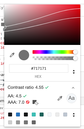
- Open the Devtools => Elements tab, and mark the DOM element that the CSS color rule.
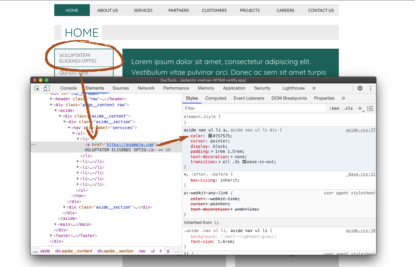
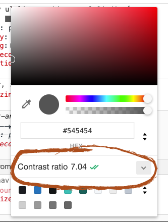
- Click on the color cube next to the color rule, a popup modal with a few color adjustment features. Down to its middle, you will find a "Contrast ratio" section. Note that this section is available only for the "color" rule and will not be available when opening this modal from a "background-color" rule, since only the color contrast of text matters for accessibility. The number next to the title is the current contrast ratio, and the two green check marks indicate that the current contrast ratio meets the requirements of all the conformance levels.
- Now, let's expand the "Contrast ratio" section, and you'll be able to see a few changes.
Here you can see each conformance level separately. You can also see the minimum contrast each of them requires. We will get back to these later. Notice that two lines now cross the color picker on the top part. These lines represent the borders of the "safe zone". When the center of the circle (marked with the green arrow) is below the top line, the contrast tattoo meets the AA conformance level, and if it is below the bottom line, it also meets the AAA conformance level. Note that these directions can be reversed, depending on the background color. When the background is lighter, the safe zone will be from the lines and down, and if the background color is darker, it will be from the lines and up.
The image above shows the contrast that meets all the conformance levels. Let's see how it looks when the color contrast fails to meet the minimum ratio.
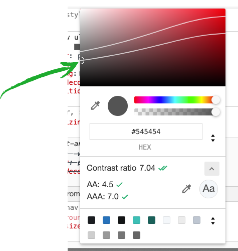
In the image above you can see a text color that fails to meet the minimum contrast ratio required for both conformance levels. The green check marks are replaced by a “ 🚫 ” sign and a color cube with a curved arrow. Clicking on these color cubes will give you the closest color that meets the minimum contrast ratio.
All you have to do now, is replace the color on the CSS file.
How Users Are Affected
When the color contrast of the text does not meet the minimum requirements of the WCAG, people with certain visual impairments may find the text unreadable. Let's look at a few examples:
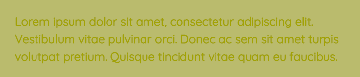
This is the original text block. The color contrast of the text in the image below does not meet the minimum requirements. The text is still readable by the average user, even if it is not very comfortable to read.

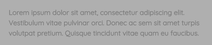
Now let’s see how people with certain visual impairments see a specific text block.
For example, the image below is how people with Protanopia (unable to see the color red) will see the same text block:
And this is how people with Achromatopsia (not able to see color at all) will see the same text block:
Low color contrast affects different visual impairments in different ways so the minimum ratio of text color contrast is set as a common denominator that addresses a wide range of impediments.
WCAG Success criteria
This issue might cause elements to fail one or more of the following Success criteria:
1.4.3 Contrast (Minimum) (AA)
Recommended Reading
- Understanding Contrast (Minimum)
- Color Theory and Contrast Ratios By Christopher Schmitt