accessible name
All interactable elements must have an accessible name
Description
Every UI element that has interactable characteristics (e.g. button, link, inputs etc.) is expected to have a child text node and/or dedicated attribute that constitutes its accessible name. The accessible name is used by assistive technologies to read and display the element in a unique and meaningful way. Read more about accessible names on A11y concepts > Accessible names
Quick Fixes
1<!-- The text node inside the anchor element constitutes its accessible name -->2<a href="/about">About us</a>34<!-- The img tag's alt attribute constitutes the anchor's accessible name -->5<button type="submit">6 <img src="./envelope-icon.png" alt="send" />7</button>
1<!-- Button gets its accessible name from the aria-label attribute -->2<button aria-label="send">3 <img src="envelope-icon.png" aria-hidden="true" />4</button>56<!-- The button's accessible name is "submit form" the aria-label attribute is overriding the content value -->7<button aria-label="submit form">8 Send9</button>
Learn more about accessible names and other fix options on: A11y concepts > Accessible names
How Users Are Affected
The accessible name is used by assistive technologies to label, announce and trigger actions of interactable UI elements (e.g. buttons, links, input fields etc.). When interactable elements don’t have a valid accessible name, assistive technologies lack the hook they are designed to use.
Screen Reader Users
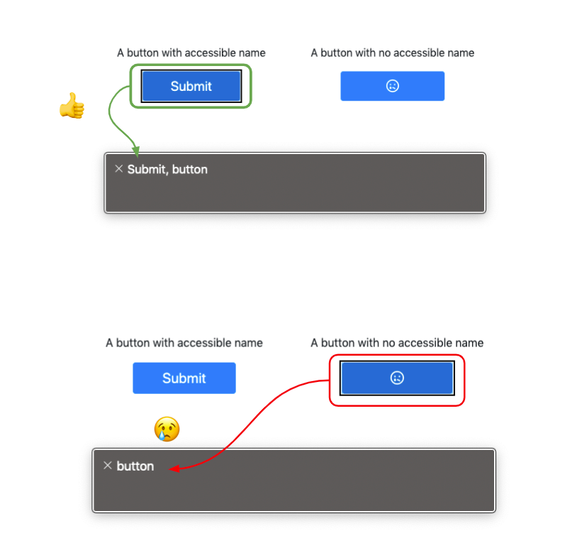
Look at the examples below. The gray frame shows what the screen reader (VoiceOver) is actually reading. On the top image you can see that the button has an accessible name from its internal text node. The screen reader is announcing the accessible name and then the widget type. That allows the user to get the full context and have a better understanding of the meaning and objectives of the element.
On the bottom image, there is a button that has no accessible name. You can see that the screen reader is generally announcing it as a button, but doesn’t give context.
Another conclusion that is important to take from the above is that the accessible name should be meaningful and descriptive enough to fulfill its full purpose.

Voice Control
Voice control software and devices use the accessible names as “voice hooks” for the user to interact with.
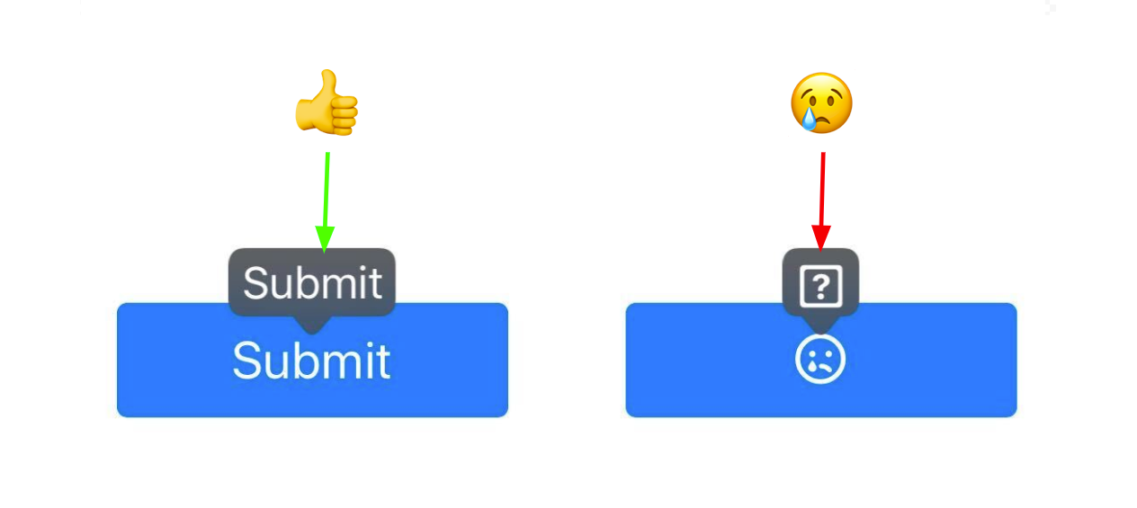
In the image below, the gray tooltips are the accessible names that the voice control software detected (in this case IOS Voice Control). You can see that the button that does not have an accessible name is indicated with a question mark, and does not have an explicit hook for vocal interaction.

WCAG Success criteria
This issue might cause elements to fail one or more of the following Success criteria:
1.3.1 Info and relationships (A) | 2.4.6 Headings and labels (AA) | 4.1.2 Name, role, value (A)