As noted in the WAI-ARIA 1.2 W3C Recommendations for the Combobox Pattern, �“the features and behaviors of combobox implementations vary widely.” Regardless its form, a combobox can and should be constructed to be accessible to all users. To do so, requires attention to the principles and guidelines for creating an accessible user experience rather than simply following a prescription for “how to make a combobox.”
Combobox
A combobox is a type of input form control with an associated widget that can dynamically pop up to assist users in setting a value.
The popup is a widget that is collapsed by default and expanded by user action. When expanded, the popup provides an interface that can be used to set a value for the input. In the simplest and most common case, the popup presents a list of options for the user’s selection.
The popup must be a listbox, grid, tree, or dialog. Unless the popup is a dialog, keyboard focus remains on the combobox while a user navigates the popup using arrow keys and makes a selection or uses a pointer to make a selection. For a dialog popup, keyboard focus moves into the dialog then returns to the combobox when it is closed.
When the input field is editable, the popup options are considered to be suggestions that may be accepted or not. When the input field is readonly, it displays a value that can only be changed by making a selection from the popup.
Whether listbox, grid, tree, or dialog, the function of the popup should be
limited to the selection of a single value for the combobox. For other
applications, a Button or other interactive widget that supports the
aria-haspopup ARIA property should be used to control the popup.
A common behavior for an editable combobox is autocompletion, where a typed entry in the input field affects the options displayed in the popup and could also fill the input field with a suggested completion.
Combobox examples
HTML input with datalist
Though features and behaviors of combobox implementation vary significantly,
those built using native HTML elements that have an implicit combobox role are
the most common and set users’ expectations for all combobox forms.
Understanding their operation and affordances is key to creating a custom
combobox that users can operate successfully.
The native HTML element input type=text (the default if type is not
explicitly set) is an editable combobox when it has a list attribute
referencing a datalist element. The option element values in the
datalist are considered as suggestions that can be accepted—or not.
Structure
HTML
1<!--example input with datalist-->2<label for="ice-cream-choice">Choose an ice-cream flavor:</label>3<input4 id="ice-cream-choice"5 list="ice-cream-flavors"6 name="ice-cream-choice"7 type="text">8<datalist id="ice-cream-flavors">9 <option>Butter Pecan</option>10 <option>Chocolate</option>11 <option>Cookies and Cream</option>12 <option>Strawberry</option>13 <option>Tutti Frutti</option>14 <option>Vanilla</option>15</datalist>
ARIA
No ARIA attributes need or should be applied for this native HTML combobox to be accessible to screen reader users. When encountered, screen readers announce the input as an editable combobox with a popup with suggestions and announce its current state and location as it is operated.
User Interaction
In the following, highlight means to activate an option by arrow-key
navigation or pointer hover to consider its selection and select means to
assign an active option value to the input element. With this combobox,
selection does not follow focus. A user may leave an expanded popup without
changing the input value.
Keyboard interaction
Keyboard focus
Some browsers in some environments open the popup. Some do not. In Chrome and Edge browsers, an icon (“▼” or similar) is displayed to indicate the availability of a “dropdown.”
ArrowDown
- Popup collapsed: Display listbox popup. Most browsers highlight the first option.
- Popup expanded: Advance highlight to the next option. Some browsers wrap to the first option, some do not.
ArrowUp
- Popup collapsed: Display listbox popup. Most browsers highlight the first option.
- Popup expanded: Advance highlight to the previous option. Some browsers wrap to the last option, some do not.
Printable character
Display popup with only the option elements having a value that is contained
in the entry string. None are highlighted.
Enter
- Popup collapsed: When used with a form, submit form with the
inputnamd and value. - Popup expanded: Select highlighted option, if any, and close popup. Do not submit form.
Tab or Shift+Tab
Most browsers select a highlighted option element, if any, before closing an
open popup and moving keyboard focus to the next or previous element in the tab
sequence.
Escape
Close an open popup without, in most browsers, selecting an option.
Pointer interaction
Input hover
Hovering over the input field displays the down-arrow icon in Chrome and Edge browsers (unless styled with CSS).
Input click
Focus the input element and open popup, highlighting none.
Option hover
Most browsers highlight the option.
Option pointerup
Select the option. Most browsers do not select on pointerdown or click
events, allowing users to move the pointer to a different option element
before selecting.
Touch interface
The native HTML combobox constructed with input and datalist elements
present a touch interface in mobile iOS and Android browsers that, in most
cases, replicate expected behavior for both keyboard and pointer device users. A
sustained touch sets focus and fires a pointerdown event, then a pointerup
event when touch is removed. A quick tap is needed to fire a click event.
A significant difference in behaviour between mobile and desktop browsers that may be difficult to achieve with a custom combobox is the manner in which options are presented. When the text field receives focus on a mobile device, the options may appear as a set of buttons at the top of the touch interface keyboard rather than in a listbox popup.
HTML select element
The HTML select element with option children is a listbox when it has a
multiple attribute and a combobox with a listbox popup without it.
Example select combobox
1<label for="favorite-pet">Your favorite pet</label>2<select id="favorite-pet" name="pets">3 <option value="">--Please select--</option>4 <option>Dog</option>5 <option>Cat</option>6 <option>Chinchilla</option>7 <option>Hamster</option>8 <option>Parrot</option>9 <option>Spider</option>10</select>
The select element is not editable. Its value is a computed property set by
the first child option with a true value for its selected (JavaScript)
property or, if none, the empty string. (This is one of those cases where the
HTML attribute and JavaScript property may differ. The selected attribute only
sets the initial value of the property before user interaction.)
Unfortunately, select element behavior as a combobox is less than consistent
across operating systems, browsers, and screen readers. The most significant are
how it is identified in screen readers and how option selection occurs:
Windows
- NVDA and JAWS announce
selectelement’s role as “combobox” with “listbox” popup when encountered. - Selection follows focus:
selectelement value is determined when anoptionis highlighted.Escapekey does not cancel selection. ArrowDownadvances selection to the next option but does not open popup.Spaceopens popup.- Typing a character advances selection to the first option that begins with that character, if there is one, without opening popup.
macOS
- VoiceOver announces
selectelement’s role as “button” with “menu” popup when encountered. - Selection does not follow focus:
selectelement value must be explicitly set. Escape key closes popup and retains previous value. ArrowDownopens popup and advances selection to the next option.Spacealso opens popup.- Like in Windows, typing a character advances selection to the first option that begins with that character, if there is one, without opening popup.
Custom combobox with list autocomplete
Creating a combobox with behavior like that of the native input element with
an associated datalist requires the application of ARIA attribute, custom CSS,
and the use of JavaScript to control its state changes.
In this example, users are asked to input a favorite ice cream in a combobox that pops up with suggestions: Butter Pecan, Chocolate, Cookies and Cream, Strawberry, or Vanilla.
To focus on accessibility essentials, the code here is simplified and is presented only for illustrative purposes.
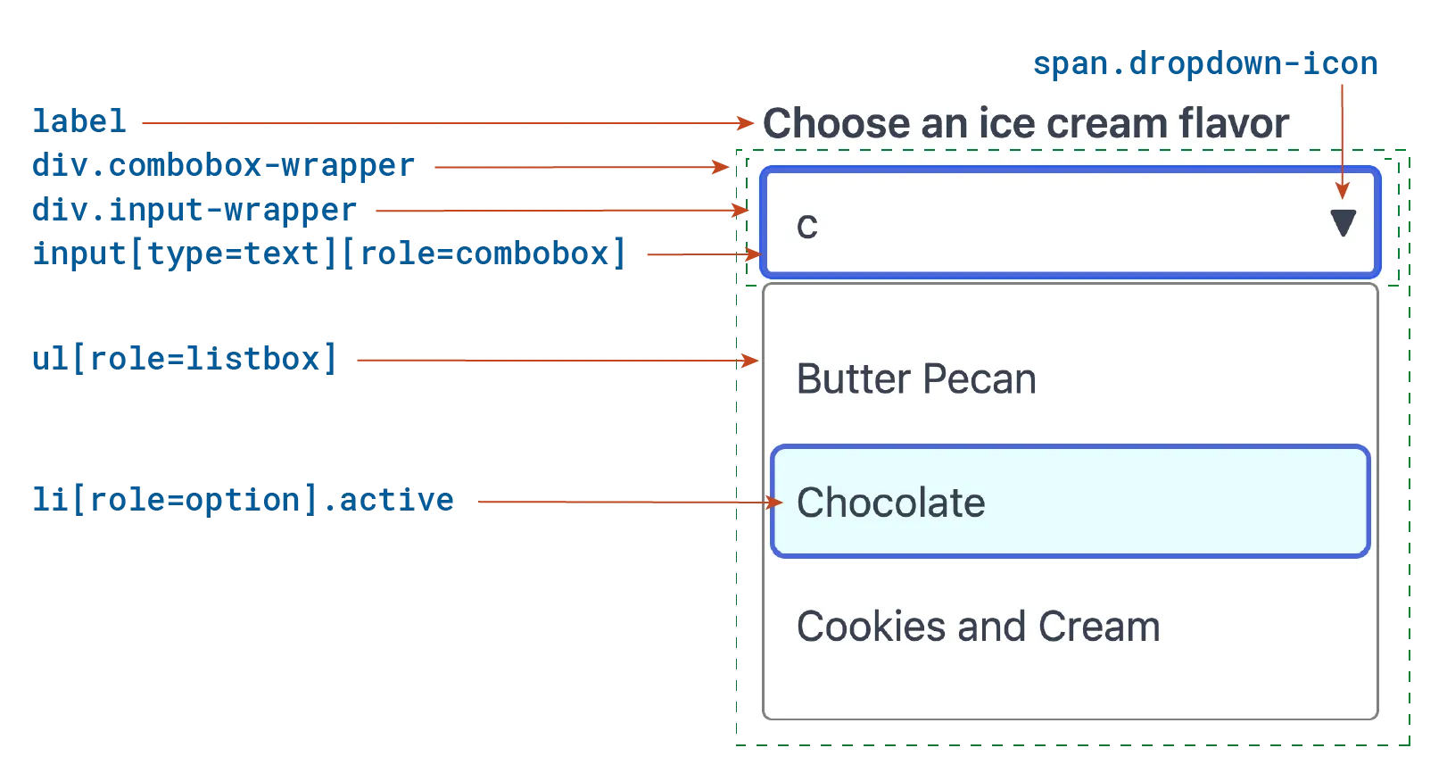
In the following illustration, a user has typed the letter “c” in the input
field, then highlighted “Chocolate” by navigating to it with the
ArrowDown key in the listbox that popped up. A full description of the
structure is in the sections that follow.
Structure
ARIA
ARIA attributes inform screen reader users what they’ve come across and how to use it. While browsers provide that with the native HTML combobox, they need to be explicitly set for a custom combobox.
- The input field has an accessibility name derived from its label.
- The input field has ARIA attributes:
roleis set tocombobox.aria-autocompleteproperty is set tolistto indicate its autocomplete behavior.aria-controlsproperty references the ID of therole=listboxelement.aria-haspopupproperty is set to the role,listbox, of its popup.aria-expandedstate is set totruewhen the popup is open andfalsewhen collapsed.aria-activedescendentproperty is dynamically set to the ID of the option that has been highlighted by user arrow-key navigation.
- The
ullistbox has ARIA attributes:roleis set tolistbox.aria-labelledbyis set to the ID of the input label, providing it with an accessibility name.
- The
lielements have ARIA attributes:roleis set tooption.aria-selectedis dynamically set totruewhen an option is selected andfalseotherwise.
Unlike a standalone listbox, where selection occurs immediately when an option
is focused, selection does not occur here until the input value is assigned
when a user takes a further action in the listbox popup by using the
Enter key or releasing a pressed pointer on a highlighted option.
HTML structure with “Chocolate” highlighted
1<!-- Combobox HTML with an active option -->2<label id="cbxLabel" for="cbxInput">3 Choose an ice cream flavor:4</label>5<div class="combobox-wrapper">6 <div class="input-wrapper">7 <input8 id="cbxInput"9 type="text"10 name="ice-cream-choice"11 role="combobox"12 autocomplete="off"13 aria-autocomplete="list"14 aria-controls="cbxListbox"15 aria-haspopup="listbox"16 aria-expanded="true"17 aria-activedescendant="cbxOption1"18 value="c"19 />20 <span class="dropdown-icon" role="presentation">▼</span>21 </div>22 <ul23 id="cbxListbox"24 class="open"25 role="listbox"26 aria-labelledby="cbxLabel">27 <li id="cbxOption0" role="option" aria-selected="false">28 Butter Pecan29 </li>30 <li id="cbxOption1" role="option" aria-selected="false" class="active">31 Chocolate32 </li>33 <li id="cbxOption2" role="option" aria-selected="false">34 Cookies and Cream35 </li>36 </ul>37</div>
Notes:
- The input element has
autocomplete=offto prevent some browsers from popping up a separate listbox with previously typed entries as additional suggestions. (Intended to be helpful, but not so much in this case.) - The dropdown icon is simply a visual affordance here rather than a button. Clicking or tapping on the input field itself opens the popup.
HTML structure with “Chocolate” selected
1<!--Selecting an option value closes the popup and sets the combobox value.-->2<label id="cbxLabel" for="cbxInput">3 Choose an ice cream flavor:4</label>5<div class="combobox-wrapper">6 <div class="input-wrapper">7 <input8 id="cbxInput"9 type="text"10 name="ice-cream-choice"11 role="combobox"12 autocomplete="off"13 aria-autocomplete="list"14 aria-controls="cbxListbox"15 aria-haspopup="listbox"16 aria-expanded="false"17 value="Chocolate"18 />19 <span class="dropdown-icon" role="presentation">▼</span>20 </div>21 <ul22 id="cbxListbox"23 role="listbox"24 aria-labelledby="cbxLabel">25 <li id="cbxOption1" role="option" aria-selected="true">26 Chocolate27 </li>28 </ul>29</div>
CSS
While most of these CSS rules implement styling choices, a few play a role in the function and accessibility of the combobox:
- Focus and hover visibility provided with
:focusand:hoverpseudo classes - Popup display provided with
[role=listbox].open - Option navigation visibility provided with
[role=option].active
1.combobox-wrapper {23 position: relative;4 max-width: 320px;56 .input-wrapper {7 position: relative;8 display: flex;9 align-items: center;10 max-width: 320px;11 }1213 input {14 display: block;15 width: 100%;16 padding: 8px 48px 8px 12px;17 outline: 1px solid gray;18 outline-offset: -1px;19 border-radius: 4px;20 background: #fff;21 }2223 input + .dropdown-icon {24 display: none;25 position: absolute;26 right: 0.5em;27 pointer-events: none;28 }2930 input:focus {31 outline: 2px solid royalblue;32 outline-offset: -2px;33 }3435 input:focus + .dropdown-icon,36 input:hover + .dropdown-icon {37 display: block;38 }3940 ul[role=listbox] {41 position: absolute;42 display: none;43 width: 100%;44 max-width: 320px;45 margin-top: 2px;46 padding: 8px 4px;47 background: white;48 border: 1px solid gray;49 border-radius: 4px;50 z-index: 10;51 list-style: none;52 }5354 ul[role=listbox].open {55 display: block;56 }5758 [role=option] {59 width: 100%;60 font-size: 16px;61 line-height: 2;62 padding: 4px 8px;63 border-radius: 4px;64 }6566 [role=option].active,67 [role=option]:hover {68 background: lightcyan;69 outline: solid 1px royalblue;70 }71}
User Interaction
Actions
Because interaction can be implemented using JavaScript with a variety of methods and frameworks, here we simply outline what should occur.
When users interact with this combobox, its HTML structure and attributes changes in the following ways:
When opening the popup:
class="open"is set on the listbox element.aria-expanded="true"is set on the input element.
When closing the popup:
class="open"is removed from the listbox element.aria-expanded="false"is set on the input element.aria-activedescentantis removed from the input element if set.class="active"is removed from a highlighted option.
When highlighting an option:
class="active"is set on the option.aria-activedescendantis set on the input element to the ID of the active option.
When selecting an option:
aria-selected="true"is set on the selected option.- The combobox value is set to the selected option value.
- The popup is collapsed.
Selection occurs on the keyup event so that keyboard users can cancel an
mistaken selection with the Escape key and on the pointerup event so that
pointer device users may move the pointer to the desired option with the pointer
down.
Keyboard interaction
This combobox has list aria-autocomplete behavior. When there is an entry
in the input field, only those options that contain the entry string
(independent of case) are included in the listbox popup. In our example, the
letter “c” in the input field filters the options to “Butter Pecan,” “C
hocolate,” and “Cookies and Cream.” With no entry, all options are
displayed. With no match, no popup.
Keyboard focus
The popup does not open when the input element is focused.
Printable character
- With popup collapsed, open listbox popup with matching options if any match, highlighting none.
- With popup expanded, filter options to display only those with matching options. Do not highlight any option. Close popup if none match.
Display popup with only those options containing the entry string without highlighting any.
ArrowDown
- With popup collapsed, open listbox with options matching entry string or, if no entry, all options, then highlight the first option.
- With popup expanded, highlight the next option, wrapping to the first on the last option.
Alt + ArrowDown
- With popup collapsed, open listbox with options matching entry string or, if no entry, all options. Do not highlight any option.
- With popup expanded, do nothing.
ArrowUp
- With popup collapsed, open listbox with options matching entry string or, if no entry, all options, then highlight the last option.
- With popup expanded, highlight the previous option, wrapping to the last on the first option.
Escape
- With popup expanded, close popup without selecting.
Enter
- With popup collapsed, perform default action. When used in a form, typically, this action will submit the form.
- With popup expanded, select highlighted option, if any, and close popup. Prevent default action to submit form.
Tab or Shift+Tab
- With popup collapsed, perform default action and change keyboard focus to the next or previous element in the tab sequence.
- With popup expanded, select highlighted option, if any, and close popup. Prevent default action and keep keyboard focus on the input element.
Though selection on Tab is common and many if not most users may expect that,
some may not, and they might not realize that they have set a value if the focus
change moves the combobox away from their immediate attention. So, the choice
here is to retain focus on the input so that the action may be confirmed (as it
is with the Enter key) before moving on with a subsequent
Tab press.
Pointer interaction
Input click
- Open popup.
- By using the native
inputelement, afocusevent followspointerdownand does not need to be explicitly handled.
Popup pointerover
- To prevent a
clickon the popup causing a focus drop, disableblurevent on input.
Popup pointerleave
- Enable but do not trigger a
blurevent on input.
Option pointerup
- Select option and close popup.
More examples
Refer to the WAI ARIA Practices Guide for the Combobox Pattern and other references listed under Recommended reading for implementation guidelines.
Accessibility criteria
Several Web Content Accessibility Guidelines need to be considered when designing and developing comboboxes. The criteria described here do not include general criteria, such as color contrast, which must be considered for all content.
Correct information
Users must be informed of the combobox, its nature and properties, and to work properly, user agents (browsers) and assistive technologies must interpret the combobox composite structure and its properties correctly.
Role
HTML structures that convey information through presentation have
a semantic role that must be conveyed to assistive technologies. Role is
automatic for a native HTML combobox, such as input element referencing a
datalist element, but the ARIA role attribute must be explicitly set for all
semantic elements of a custom combobox.
- The combobox input element has
roleset tocombobox. - The popup widget has
roleset tolistbox,grid,treeordialog. - The semantic elements of the popup composite have
roleset according to its structure:- Each navigable item in a
listboxhasrole="option". - Each navigable item in a
gridhasroleset togridcell,rowheader, orcolumnheaderaccording to its structure. - Each navigable item in a
treehasroleset totreeitem. - Navigation in a
dialogpopup is according to its embedded tab sequence with each item having a role according to its function.
- Each navigable item in a
Accessibility Label
Every element of a combobox widget that has a semantic role should also have an accessible name so that screen reader users are aware of which such element they are on, information they cannot get from its visual context.
Each semantic element should have a unique label:
- The combobox input element
- Each of the navigable components of the popup composite.
- The popup composite itself
The label can be provided in a number of ways, detailed in the following WCAG Techniques:
Name and Value
A combobox is a kind of input, a form control, that must have name and value
properties that can be submitted with a form that owns it. For that purpose, the
combobox input element must be one of the following:
- An
inputelement withnameandvalueattributes or properties. (Theinputelement should not have themultipleattribute when used as a combobox.) - A
buttonelement withnameandvalueattributes or properties. - A
selectelement withnameattribute andvalueproperty set from selected, ownedoptionelement. - a form-associated custom element
Note that setting an accessibility label for the combobox does not set its
name property. They have separate purposes and usually have separate values.
Popup Identified
The combobox aria-controls property must identify the ID of the popup
element so that browsers and assistive technologies are aware of the
relationship.
Note: An input element with a list attribute referencing a datalist
element provides this relationship.
An earlier WAI-ARIA recommendation was to set aria-owns rather than
aria-controls, and that led to problems. Use of aria-owns in this context
is now deprecated and should not be used.
Popup Role
The combobox aria-haspopup property must correctly identify the role of its
associated popup so that users are aware of its nature. If set, it must have one
of the following values and must correspond to the popup role:
listbox (default)
The popup has listbox role.
grid
The popup has grid role.
tree
The popup has tree role.
dialog
The popup has dialog role.
Expanded and Collapsed States
With a custom combobox, screen readers inform their users of the availability of
the popup according to the value of the aria-expanded attribute of the
combobox input element. (No default value.)
true
The popup is displayed and available to all users.
false
The popup is hidden and unavailable to all users.
Active Option
When keyboard users navigate the listbox, grid, or tree popup associated with a combobox, keyboard focus remains on the combobox itself, while an interactive element within the popup become “active” when a user navigates to it. The active element is then the object of keyboard action on the combobox input, either handled by custom JavaScript in a custom combobox or by the browser in a native HTML combobox.
So that users are aware when a popup element is active, a custom combobox must:
- Set
aria-activedescendanton the combobox input element to the ID of the active element so that screen readers are aware of which element is active. ( Note: Setting this attribute will not make the element active — that must be handed in code.) - Set a visual focus indicator on the active element in addition to the visual focus indicator on the input element itself.
Selected Option
A selectable popup element (with role option, gridcell or treeitem) should
set
aria-selected to convey its selected state to assistive technologies.
An option, gridcell, or treeitem selectable element is selected when the combobox input has its value. This differs from the behavior when a listbox, grid, or tree is directly in the tab sequence, where selection occurs when a selectable item receives visual focus.
undefined (default)
The element is not selectable.
true
The option, gridcell or treeitem value is selected and assigned to the combobox input value.
false
The option, gridcell or treeitem is not selected.
Do not set aria-checked. Though these roles also support aria-checked, its
purpose is for multiselect applications and should not be set in a combobox
widget.
The criteria here for aria-selected follows the accessibility API mapping
for the option element, where the value of aria-selected corresponds to the
selected property of the element’s JavaScript HTMLOptionElement object, which
is true only when the option’s parent select element is assigned the option’s
value.
In some cases, this criteria will deviate from the current ARIA Authoring
Practices Guide (APG) for the Combobox Pattern, which is to set
aria-selected="true" when a selectable element is the active element
referenced by aria-activedescendant —has visual focus. That is consistent when
selection follows focus, as it does when focusing a select option in a Windows
environment. However, selection following focus is not universal (for example,
selection does not occur when focusing on a select option in macOS)
nor is it an accessibility guideline, but a behavior best determined with
consideration for user experience.
Inconsistency regarding selection following focus is an acknowledged open issue in the APG guidelines for combobox, and may be resolved in a future update.
Autocomplete Behavior
Set aria-autocomplete property on the input element to inform screen reader
users how the combobox will respond when typing in the input field. If set, it’s
value must be one of the following tokens:
none (default)
The input is not autofilled, and all options are displayed when the popup is triggered.
inline
The input is editable, and when typing, text could be dynamically inserted after the caret with a suggested way to complete the entry.
list
The input is editable, and when typing, a popup may be displayed with a list of options that match or suggested values that could complete the entry.
both
Both inline and list autocompletion occur.
When the options in a listbox popup are filtered (aria-autocomplete set to
either list or both), screen reader users should be aware of the current
number of options available. That information is conveyed by default for a
combobox using input with datalist> or a ul or ol element for a custom
listbox. Otherwise, a custom combobox should dynamically set aria-setsize on
the element with role=listbox and aria-posinset on the element with
role=option.
When developing a custom combobox, care must be taken to maintain consistency
with browsers’ autofill behavior influenced by the HTML autocomplete
attribute.
The autocomplete attribute, which is available on input elements and a few
others, provides hints to user agents in how a browser may provide suggestions
for the input based on information it has stored about a user, such as a user’s
name, address and phone number. The autocomplete value provides a hint. Its
default value is on so that a user agent may provide autofill suggestions
however it may, and some browsers will provide a list of previously entered
values as suggestions or more specific user information when it can use
heuristics to determine the input’s purpose.
If browser autocomplete is not needed or interferes, set the HTML attribute
autocomplete="off" to avoid conflicting behavior.
Disabled Element
The aria-disabled attribute should not be set on an element that supports
the
disabled attribute, which include the button, input, option and
select elements. Use the disabled attribute directly. When using other
elements to implement a custom combobox, the aria-disabled value, true or
false (default), must correspond to its operational state.
Invalid Entry
If a combobox is editable but some entries may be rejected as invalid by the
author’s code, aria-invalid attribute should be set on the combobox input
with an invalid entry and a suggestion for correction should be provided, if one
is known. The correction message should be referenced by the
aria-errormessage on the input.
Users can operate
All users can operate the user interface, whether they are using a mouse, a keyboard, a touch interface or any kind of assistive technology. All interface technologies rely on correct keyboard and pointer operation.
Keyboard Operation
Keyboard Focus
The combobox input must be the only widget element in the tab sequence.
Listbox, Grid, and Tree Popup
For listbox, grid, and tree popups, keyboard focus should remain on the input element while operating. A custom combobox should follow the ARIA Authoring Practices Guide “Developing a Keyboard Interface” by implementing keyboard event handlers to navigate popup interactive elements with arrow keys.
Dialog Popup
Keyboard focus should be transferred to a dialog popup for navigation using the
Tab key within the dialog’s internal tab sequence. When the dialog is closed,
keyboard focus should return to the combobox input.
Keyboard Operable
Keyboard users must be able to operate all functions of the combobox.
Keyboard Events
Interactive HTML elements, such as buttons and input fields, provide keyboard
operation by default for their native behavior. For example, a click event
occurs on a button when activated with a mouse, a tap or double tap on a touch
screen, or an Enter key when the button is focused or can perform a form
submission. When using custom elements, explicit event handlers are needed to
enable keyboard users to fully use the combobox.
Use the keydown and keyup events to trigger actions. Avoid the keypress
event.
keydown
Handle the keydown event to invoke an immediate action or to cancel the
default action. If a click event is fired on the target element with the
relevant keyboard action, best practice is to handle the click event rather
than the keydown event.
keyup
Use the keyup event to handle critical actions so that users may cancel an
errant key press with the Esc key, which they can do when an Esc key handler
is also in place.
keypress
The keypress is deprecated in W3C’s UIEvents specification, though it is still
supported in most browsers. It should not be used in new code. In most
situations where the keypress was appropriate, the keydown event should be
substituted. The order in which events occur on keyboard activation is as
follows:
keydowneventkeypressevent- default action, if any
keyupevent
Keyboard Conventions
A combobox should follow common conventions. One such convention is to expand
the popup with the ArrowDown. Because a combobox is a form control and the
Enter key typically submits a form, users will generally avoid using the
Enter key to expand the popup, even when it is a dialog.
The following conventions are common for listbox, grid, and tree popups, where keyboard focus remains on the combobox inputs.
ArrowDown
- Popup collapsed: If options are available, expands popup. May highlight first available option. If used with Alt key (Option in macOS), recommendation is to expand without highlighting an option.
- Popup expanded: Moves highlight and active element to the next available option, gridcell or tree node.
ArrowUp
- Popup collapsed: If options are available, may expand popup. May highlight last available option. If used with Alt key (Option in macOS), recommendation is to expand without highlighting an option.
- Popup expanded: Moves highlight and active element to the previous available option, gridcell or tree node.
Escape
- Popup expanded: Close popup without selecting.
Enter
- Popup collapsed: Default action, which may be form submission.
- Popup expanded: Default prevented. Select active (highlighted) option, gridcell or tree node and collapse popup.
Tab, Shift+Tab
- Popup collapsed: Default action, moving keyboard focus to next or previous element in tab sequence.
- Popup expanded: Convention is to select active (highlighted) option, gridcell or tree node and collapse popup. To confirm what could be an unexpected selection, also prevent the default action so that focus remains on the input element.
Additional keyboard actions may be needed or desired to navigate an expanded popup, depending on the nature of the popup.
Pointer Operation
Pointer Opens Popup
The combobox element must receive keyboard focus when it is clicked to enable text entry or option selection with a keyboard. Focus should occur when clicked if the combobox is a valid form control (which it must be) without the need for an additional event handler in a custom combobox.
Users should be able to expand the popup and make a selection using a mouse, a touch screen, a sip and puff switch or any other pointer device. A custom combobox event handler may be needed to ensure that the popup upens on either the initial or subsequent click.
Pointer Highlights
An option should become active and highlighted but not selected when hovered
and, for the benefit of touch interface users, also on the pointerdown event.
The active option should change when a user moves the pointer in the down state
to a different option. Action on both
pointerover and pointerdown events may be necessary.
Pointer Cancellation
Option selection should occur on the pointerup event, allowing users to move
the pointer while it is down to their desired option. Note that a click event
on a touch interface only occurs with a quick tap and may not occur with all
interactions.
No surprises
Users should be able to understand what happens when interacting with user interface components.
No Unexpected Change of Context
A change of context or other consequential action must not occur when selecting
an option or setting a value for the input without clear prior warning of that
action. Because some users may accidentally set a value or navigate away from an
incomplete entry because of a distraction or to get further information, best
practice is to rely on the standard form behavior to perform a consequential
action with a submit button or Enter key.
Further, keyboard focus must remain on the combobox input while editing the input or navigating a listbox, grid, or tree popup. (Focus goes into a dialog popup while it is open, then returns to the combobox when closed.)
Expanded Popup Has Options
A popup should not be made available if it has nothing to select, which often happens when autocomplete behavior has found no option matching a typed entry.
No Conflicting or Redundant ARIA
Conflicting ARIA settings can lead to unexpected or annoying behavior.
To avoid possible conflicts with how semantic HTML element roles and properties are exposed to assistive technologies, do not set ARIA attributes or assign roles that are redundant.
Explicit ARIA settings should not be set that conflict with native HTML accessibility mappings.
Summary of tests
The following table lists the issues reported by Evinced component testing for a Combobox component.
| Test | WCAG Success Criteria | Severity |
|:----------------------------------------------------|:-----------------------------------|:---------|
| aria-autocomplete invalid value | Best practice | Minor |
| aria-controls has multiple targets | Best practice | Minor |
| aria-expanded value did not change | 1.3.1 Info and Relationships (A) | Serious |
| aria-haspopup value must be listbox | 1.3.1 Info and Relationships (A) | Minor |
| Avoid aria-owns | Best practice | Minor |
| Combobox analysis cannot run | | |
| Combobox is missing aria-autocomplete attribute | Best practice | Minor |
| Combobox is missing aria-expanded attribute | 1.3.1 Info and Relationships (A) | Serious |
| Combobox list is not filtered | 4.1.2 Name, Role, Value (A) | Serious |
| Combobox options redundant ARIA attributes | 4.1.2 Name, Role, Value (A) | Serious |
| Combobox redundant aria-autocomplete | 1.3.1 Info and Relationships (A) | Serious |
| Combobox redundant ARIA attributes | 4.1.2 Name, Role, Value (A) | Minor |
| Combobox selection not cleared | | |
| Combobox selection with Enter key failed | 2.1.1 Keyboard (A) | Critical |
| Combobox value not updated with keyboard | 2.1.1 Keyboard (A) | Critical |
| Conflicting aria-expanded value | 1.3.1 Info and Relationships (A) | Critical |
| Conflicting disabled values | 4.1.2 Name, Role, Value (A) | Serious |
| Deprecated keypress listener | Best practice | Minor |
| Disabled combobox active | 1.3.1 Info and Relationships (A) | Moderate |
| Element has incorrect role | 4.1.2 Name, Role, Value (A) | Critical |
| Empty data-list | 1.3.1 Info and Relationships (A) | Critical |
| Focus lost during combobox edit | 3.2.2 On Input (A) | Serious |
| Group contains duplicate names | Best practice | Serious |
| Group members missing accessible names | 4.1.2 Name, Role, Value (A) | Critical |
| Invalid aria-controls reference | 1.3.1 Info and Relationships (A) | Minor |
| Invalid aria-haspopup value | 1.3.1 Info and Relationships (A) | Minor |
| Keyboard accessible | 2.1.1 Keyboard (A) | Critical |
| Missing aria-controls attribute | 1.3.1 Info and Relationships (A) | Minor |
| Missing contextual labeling | 1.3.1 Info and Relationships (A) | Serious |
| Missing selection indication | 1.3.1 Info and Relationships (A) | Minor |
| Redundant focusable popup | 2.4.3 Focus Order (A) | Moderate |
| Skipped combobox contents tests | 1.3.1 Info and Relationships (A) | Serious |
| Skipped selection test | | |