# Content Grouping (Mobile)
> In Android apps, elements that form one logical unit should be grouped, so assistive technologies announce them together and in order.
Source: https://knowledge.evinced.com/mobile/mobile-validations/content-grouping
Group elements that form one logical unit, so assistive technologies announce them together and in order.
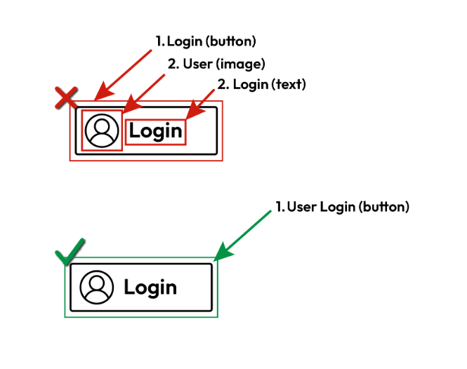
When visual and text elements belong to one logical unit, such as a button made of an icon and a label, or a message made of a title and a body, group them. Assistive technologies can then move to the unit as a single item and announce its parts together, in the correct sequence. When the parts are not grouped, screen reader users reach them one at a time, as separate items. The content becomes fragmented, and its meaning or purpose may be unclear.
**Note:** This validation applies to Android only, including Flutter and React Native apps running on Android. There are no iOS examples.
## Pass Patterns
### Android
**XML Views**
The container is focusable by screen readers, and its text views are not focusable, so they are announced together as one item.
```xml
```
**Jetpack Compose**
The clickable row merges its icon and text with `mergeDescendants`, and the children are not focusable on their own.
```kotlin
Row(
modifier = Modifier
.clickable { login() }
.semantics(mergeDescendants = true) {
role = Role.Button
},
horizontalArrangement = Arrangement.Center,
verticalAlignment = Alignment.CenterVertically,
) {
Icon(
Icons.Default.Person,
modifier = Modifier.padding(end = 8.dp),
contentDescription = "User",
)
Text(text = "Login")
}
```
### Cross Platform
Flutter (Android)
The `Semantics` widget exposes the whole button as one item with a combined label, and `excludeSemantics` hides the separate texts.
```dart
Semantics(
button: true,
label: 'Title Body',
onTap: openMessage,
excludeSemantics: true,
child: InkWell(
onTap: openMessage,
child: const Column(
mainAxisSize: MainAxisSize.min,
children: [
Text('Title'),
Text('Body'),
],
),
),
),
```
## Fail Patterns
### Android
**XML Views**
The container is focusable, but its text views are also focusable, so screen readers stop on each part separately.
```xml
```
**Jetpack Compose**
The row merges its descendants, but the icon and the text are made `focusable()`, so they are reached as separate items.
```kotlin
Row(
modifier = Modifier
.clickable { login() }
.semantics(mergeDescendants = true) {
role = Role.Button
},
horizontalArrangement = Arrangement.Center,
verticalAlignment = Alignment.CenterVertically,
) {
Icon(
Icons.Default.Person,
modifier = Modifier
.padding(end = 8.dp)
.focusable(),
contentDescription = "User",
)
Text(
modifier = Modifier.focusable(),
text = "Login",
)
}
```
### Cross Platform
Flutter (Android)
Each text is wrapped in its own `Focus` widget, so the parts of the button are reached separately.
```dart
Semantics(
button: true,
onTap: openMessage,
child: InkWell(
onTap: openMessage,
child: const Column(
mainAxisSize: MainAxisSize.min,
children: [
Focus(child: Text('Title')),
Focus(child: Text('Body')),
],
),
),
),
```
## Try It Yourself
### Using a screen reader
**New to screen reader testing, or need a refresher?**
Review this article first: [Practical guides for using screen readers](https://knowledge.evinced.com/a11y-essentials/practical-guides-for-using-screen-readers)
1. Turn on TalkBack.
2. Swipe right or left through the elements on the screen.
3. Check whether the parts of each logical unit are announced together.
**Expected results:** Each logical unit is reached as a single item, and its parts are announced together, for example “*User, Login, button*”.
**Actual results:** The screen reader stops separately on parts of the same unit, such as an icon and its text.
## FAQ
**How does this issue relate to 1.3.2 Meaningful Sequence?**
SC 1.3.2 requires that when the sequence of content affects its meaning, a correct reading sequence can be programmatically determined. Grouping the parts of a logical unit lets assistive technologies announce them together and in the intended order. When the parts are not grouped, users meet them separately, which can change the meaning or hide the relationship between them.
**Why is this issue marked as Serious?**
When related parts are announced as separate items, screen reader users may miss the context that connects them, misunderstand what a control does, or spend extra time piecing the content together. This slows tasks down and can lead to wrong actions, so it is rated serious.
## Standards and Regulations
| Standard | Success Criterion | Reference |
| --- | --- | --- |
| WCAG 2.2 | [1.3.2 Meaningful Sequence](https://www.w3.org/TR/WCAG22/#meaningful-sequence) (A) | When the sequence in which content is presented affects its meaning, a correct reading sequence can be programmatically determined. |
| EN 301 549 | [11.1.3.2 Meaningful Sequence](https://www.etsi.org/standards/etsi-301-549) | Same as the WCAG text. |
## Personas impacted by this issue
- [Screen Reader](https://knowledge.evinced.com/a11y-essentials/personas#screen-reader)
## Learn More
- [Android: Groups of related content](https://developer.android.com/guide/topics/ui/accessibility/principles#content-groups)
## Related Issues
- [focus-order](https://knowledge.evinced.com/mobile/mobile-validations/focus-order)
- [ignored-by-assistive-technology](https://knowledge.evinced.com/mobile/mobile-validations/ignored-by-assistive-technology)
- [meaningful-heading](https://knowledge.evinced.com/mobile/mobile-validations/meaningful-heading)
- [non-interactive-in-focus-sequence](https://knowledge.evinced.com/mobile/mobile-validations/non-interactive-in-focus-sequence)